WHAT I'VE LEARNED
That I love supporting my friends in their entrepreneurship journey
That being a Cancer Survivor changed my approach toward health - I started doing more research on gut health and why the gut is called a "second brain"
That I want to use art to educate people
That this experience of working on this project in the 12 weeks total, along with 5 other projects parallel, could be described as "one long feed-forward session"
That I couldn't envision it developing into this powerful, colorful gutsy story
That everyone can become the SuperHero of their own story, and Wind Hill products are just one step towards it :)
LABEL DESIGN
LOGO - placed at the top, alongside the UVP, with Gutsy featured on the back
COLORS - three primary brand colors, arranged vertically and shaped to resemble the hills of Croatia
FONT - showcased in the brand’s main colors
TEXT - bilingual, available in both English and Croatian
BROCHURE DESIGN
Designing a brochure with essential information about the brand, products, and pricing
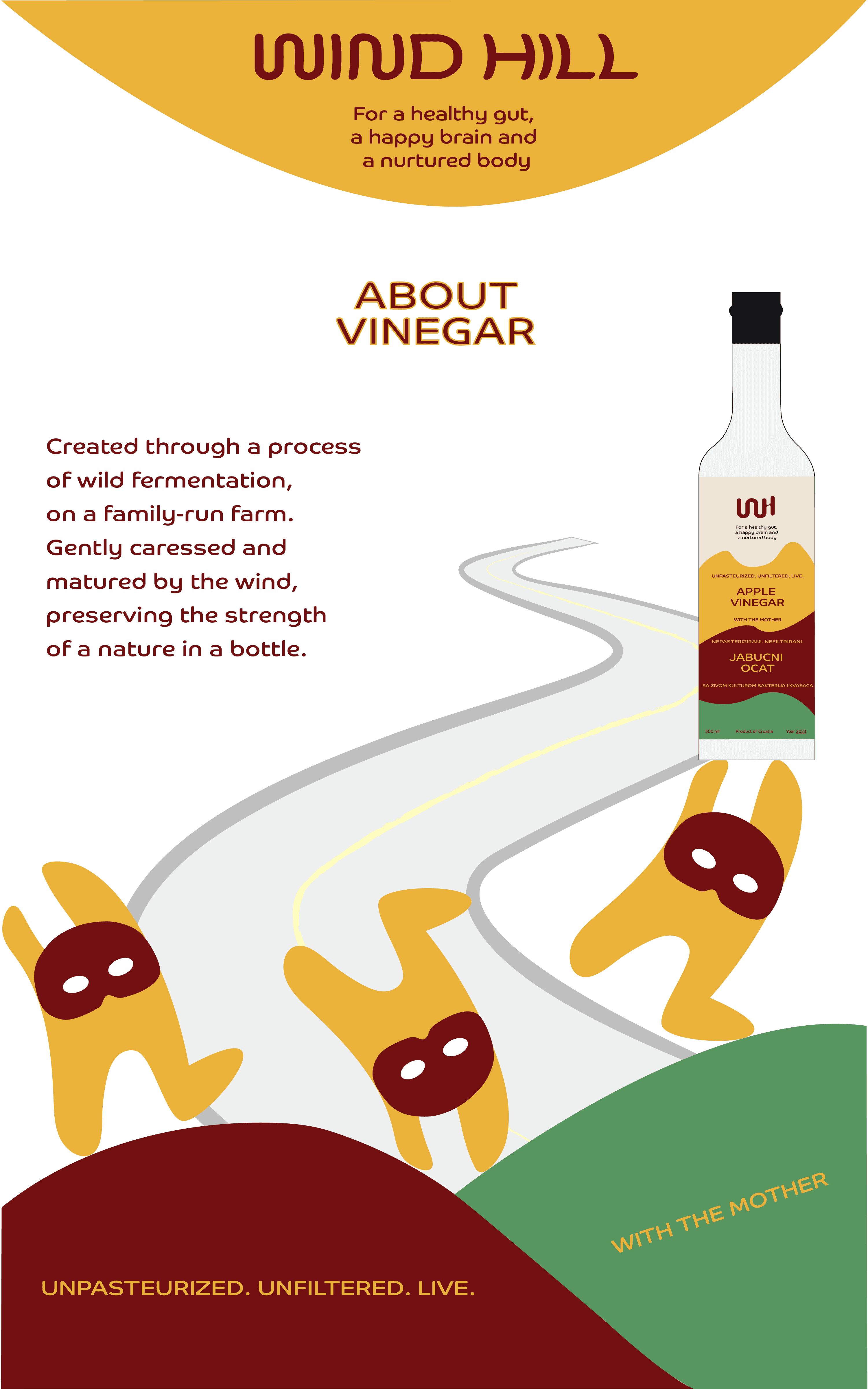
MASCOT DESIGN - GUTSY
While sketching one of the many logo designs, I drew a superhero mask on the letter "H." And just like that - "H" became a Hero, a Gut Hero - giving birth to the mascot "Gutsy"
Gutsy became the voice of Wind Hill, a communication tool symbolizing intuition, intelligence, and courage. He also served as an inspiration for the Storyboard
STORYBOARD
GOAL - creating a story about becoming the Superhero of your gut health
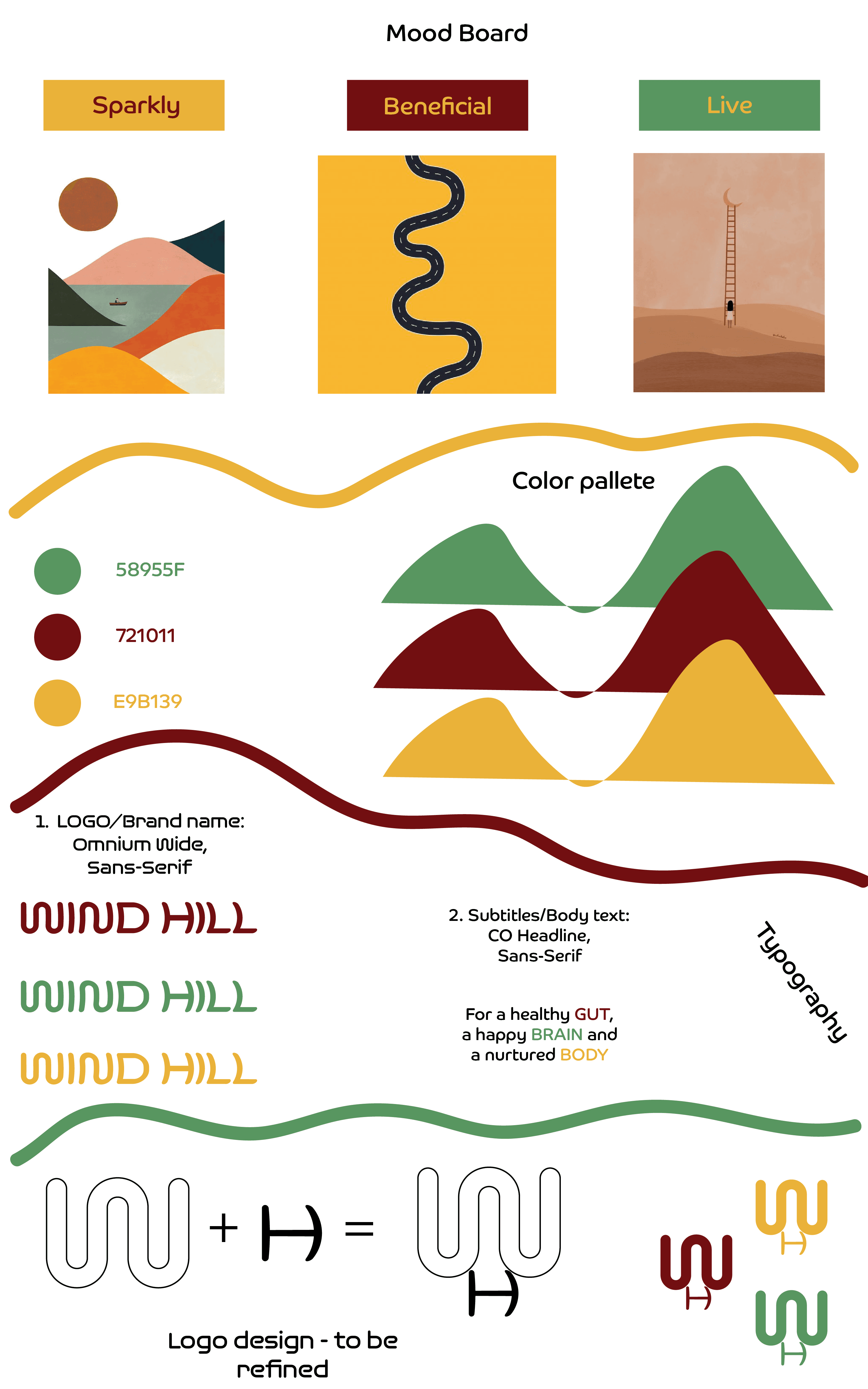
COLOR PALETTE - three colors
CHERRY RED - the color of healthy blood and various fruit cultivars for vinegar (apples, cherries, jostaberries, rosehip)
GREEN - reflects the lush, beautiful hills of Croatia, as well as fig cultivars & fields
YELLOW - inspired by the golden hues of Croatia’s hills, along with pear and medlar cultivars
TYPOGRAPHY - two fonts
OMNIUM WIDE (Sans-Serif) - for the brand name Wind Hill; windy and curved
CO HEADLINE (Sans-Serif) - for subtitles/heading/body text
BRAND DETAILS
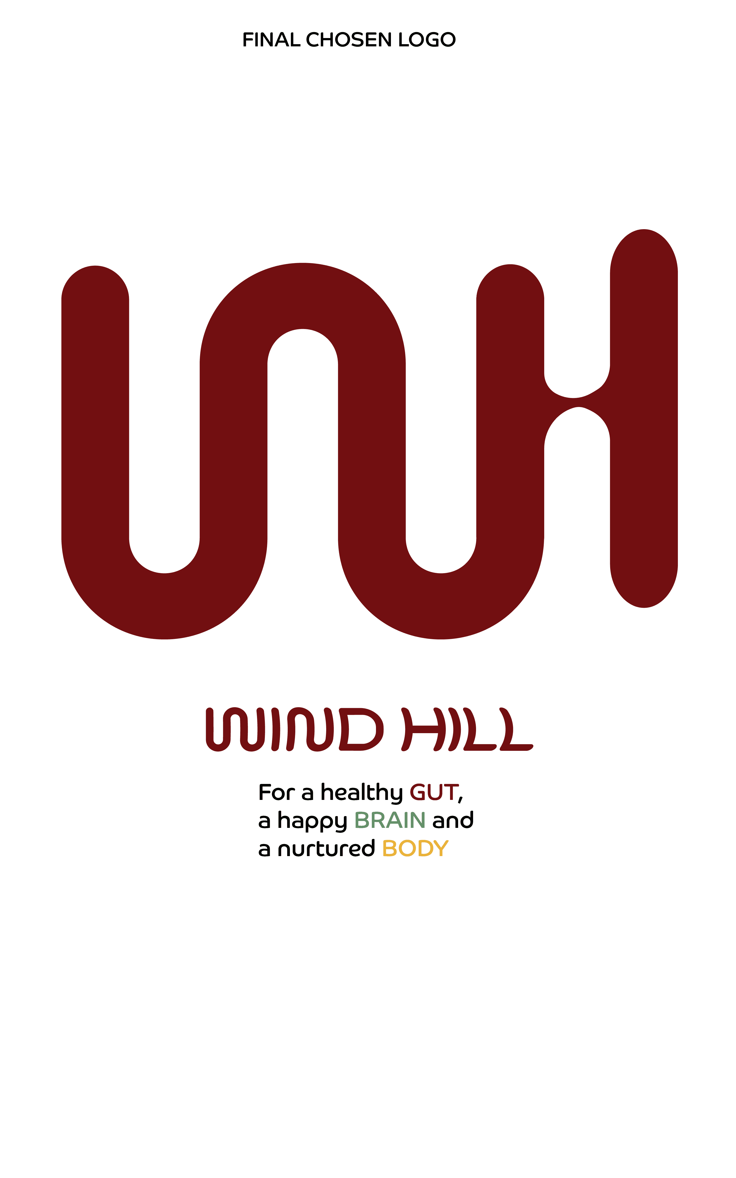
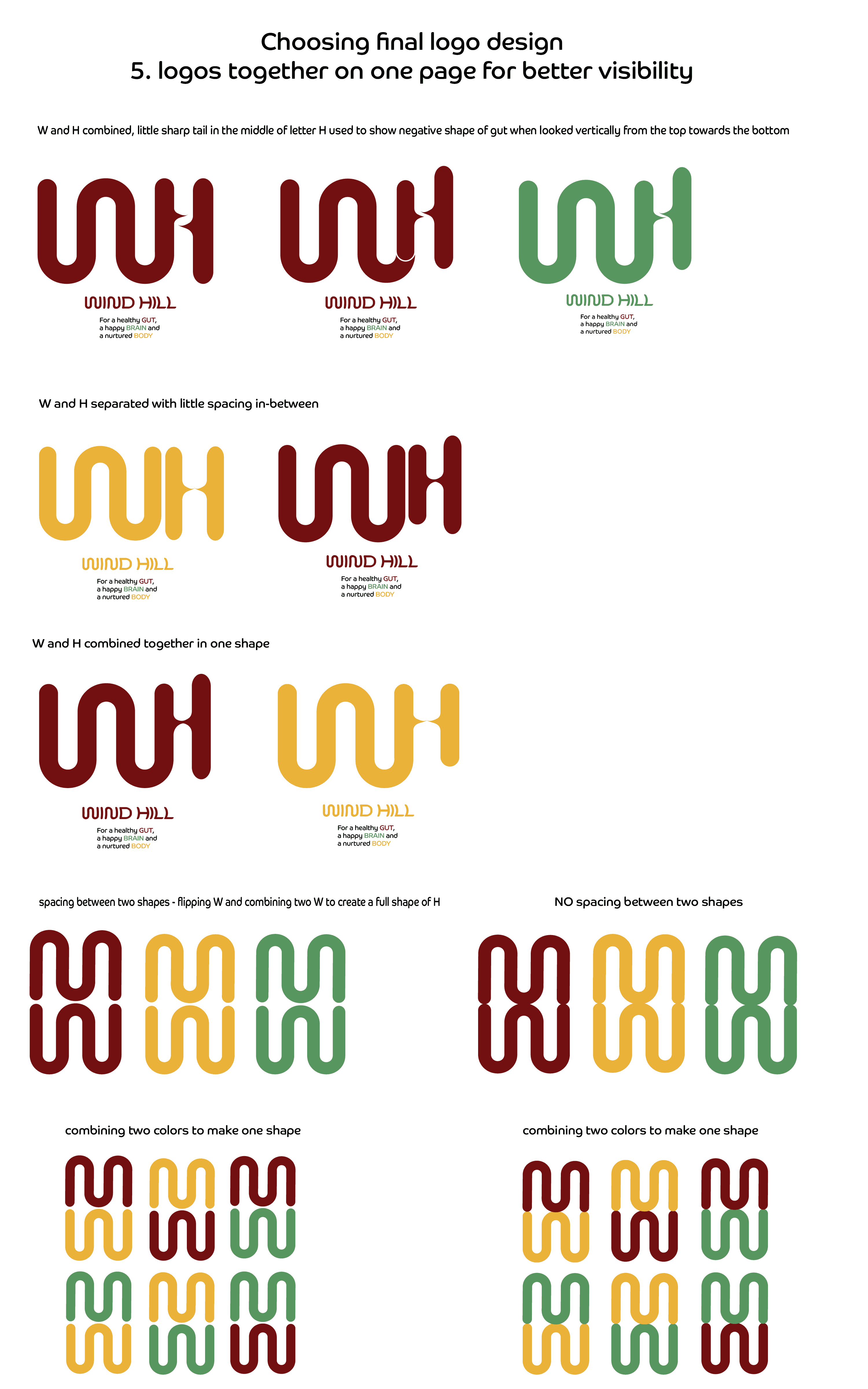
LOGO DESIGN - combining letters “W” and "H" into one shape
"W" for "WIND" - shaped like the gut, presents the curvy road to a healthy gut
"H" for "HILLS" - presents ladders to climb to get to the gut road; the little sharp tail in the middle of the letter "H" shows the negative shape of the gut
SCOPE & DELIVERABLES
This project was designed in the Graphic Design Studio course, in 12 weeks
I designed 8 deliverables:
Logo / Color palette / Typography / Label design / Mascot design / Storyboard / Brochure design / Website design
PROBLEM STATEMENT & GOALS
Delivering a message of gut health vitality to a young audience (ages 20-40)
Educating about the health benefits of WH vinegars with wild mother culture, compared to mainstream pasteurized vinegars with additives
WIND HILL IS SPARKLY, BENEFICIAL & LIVE
THE BRAND WIND HILL
Wind Hill is the name for home-grown and hand-made craft vinegar products
The vinegars are unfiltered, unpasteurized, and live, with the wild mother culture
Created through a process of slow, wild fermentation, on a family-run farm in Croatia
The result of consummation is a healthy gut, a happy brain and a nurtured body
4) BRAND IDENTITY DEVELOPMENT
Logo design
Brochure design
Storyboard
For a healthy gut,
a happy brain, and
a nurtured body
WHAT I'VE LEARNED
That I love supporting my friends in their entrepreneurship journey
That being a Cancer Survivor changed my approach toward health - I started doing more research on gut health and why the gut is called a "second brain"
That I want to use art to educate
That this experience of working on this project in the 12 weeks total, along with 5 other projects parallel, could be described as "one long feed-forward session"
That I couldn't envision it developing into this powerful, colorful gutsy story
That everyone can become the SuperHero of their own story, and Wind Hill products are just one step towards it :)
LABEL DESIGN
LOGO - placed at the top, alongside the UVP, with Gutsy featured on the back
COLORS - three primary brand colors, arranged vertically and shaped to resemble the hills of Croatia
FONT - showcased in the brand’s main colors
TEXT - bilingual, available in both English and Croatian
BROCHURE DESIGN
Designing a brochure with essential information about the brand, products, and pricing
MASCOT DESIGN - GUTSY
While sketching one of the many logo designs, I drew a superhero mask on the letter "H." And just like that - "H" became a Hero, a Gut Hero - giving birth to the mascot "Gutsy"
Gutsy became the voice of Wind Hill, a communication tool symbolizing intuition, intelligence, and courage. He also served as an inspiration for the Storyboard
STORYBOARD
Goal - creating a story about becoming the Superhero of your gut health
COLOR PALETTE - three colors
CHERRY RED - the color of healthy blood and various fruit cultivars for vinegar (apples, cherries, jostaberries, rosehip)
GREEN - reflects the lush, beautiful hills of Croatia, as well as fig cultivars & fields
YELLOW - inspired by the golden hues of Croatia’s hills, along with pear and medlar cultivars
TYPOGRAPHY - two fonts
OMNIUM WIDE (Sans-Serif) - for the brand name Wind Hill; windy and curved
CO HEADLINE (Sans-Serif) - for subtitles/heading/body text
BRAND DETAILS
Logo design - combining letters “W” and "H" into one shape
"W" for "Wind" - shaped like the gut, presents the curvy road to a healthy gut
"H" for "Hills" - presents ladders to climb to get to the gut road; the little sharp tail in the middle of the letter "H" shows the negative shape of the gut
SCOPE & DELIVERABLES
This project was designed in the Graphic Design Studio course, in 12 weeks
I designed 8 deliverables:
Logo / Color palette / Typography / Label design / Mascot design / Storyboard / Brochure design / Website design
PROBLEM STATEMENT & GOALS
Delivering a message of gut health vitality to a young audience (ages 20-40)
Educating about the health benefits of WH vinegars with wild mother culture, compared to mainstream pasteurized vinegars with additives
WIND HILL IS SPARKLY, BENEFICIAL & LIVE
THE BRAND WIND HILL
Wind Hill is the name for home-grown and hand-made craft vinegar products
The vinegars are unfiltered, unpasteurized, and live, with the wild mother culture
Created through a process of slow, wild fermentation, on a family-run farm in Croatia
The result of consummation is a healthy gut, a happy brain and a nurtured body
For a healthy gut,
a happy brain, and
a nurtured body
4) BRAND IDENTITY DEVELOPMENT
Logo design
Brochure design
Storyboard