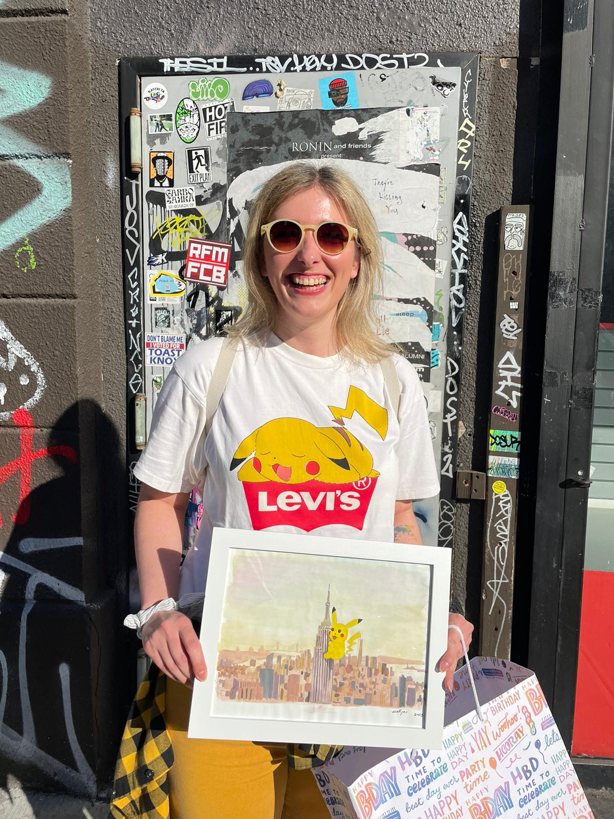
The Illustrator of happiness!
ANA
Smiley
STRATEGIC GRAPHIC DESIGNER SPECIALIZED IN PACKAGE DESIGN / STORYTELLER / BOOK ILLUSTRATOR

MOBILE DESIGN
UX
UI
Human-centered design
FOLLOW ME ON MY DESIGN JOURNEY
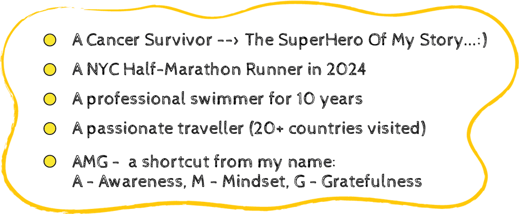
FUN FACTS
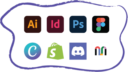
HARD SKILLS
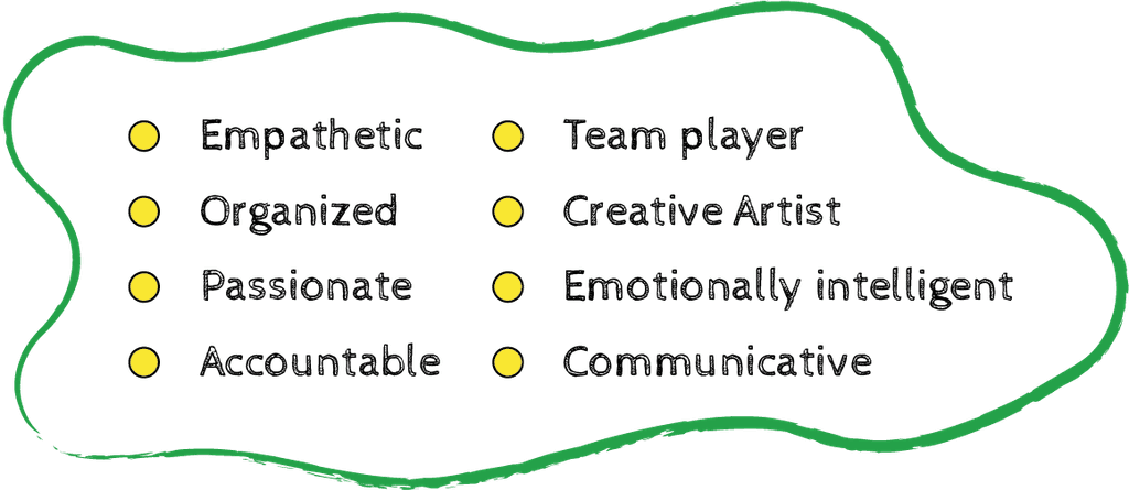
SOFT SKILLS
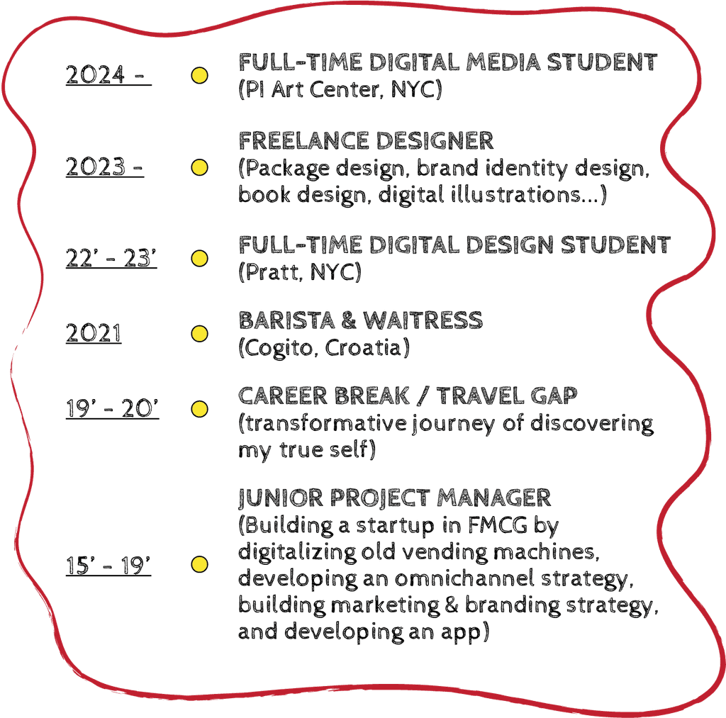
EXPERIENCE
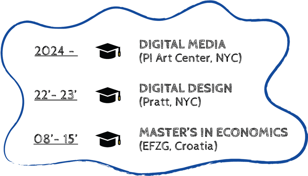
EDUCATION

-> Storyteller.
-> Book Illustrator.
-> Strategic Graphic Designer specialized in Package Design.
ABOUT
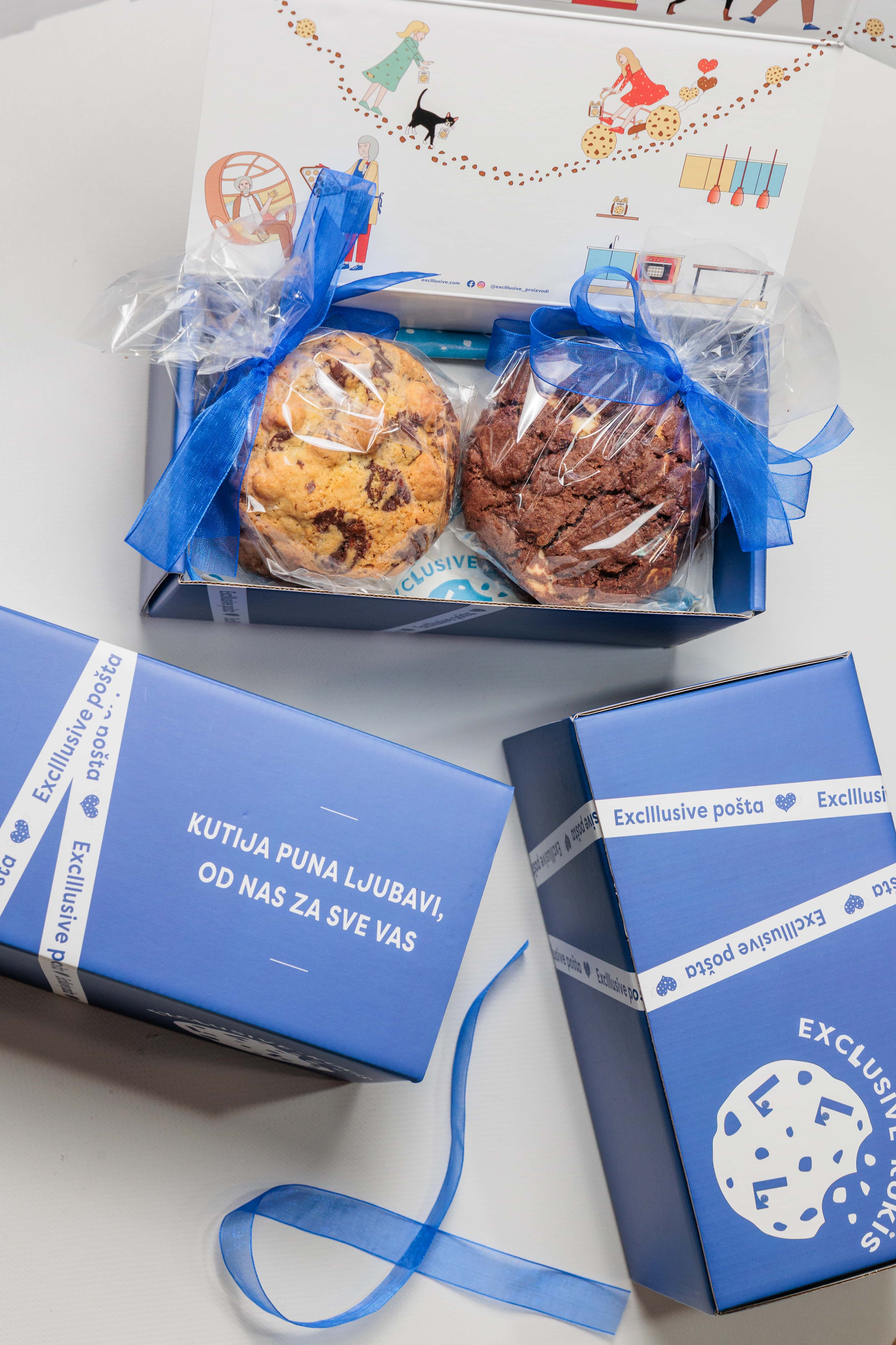
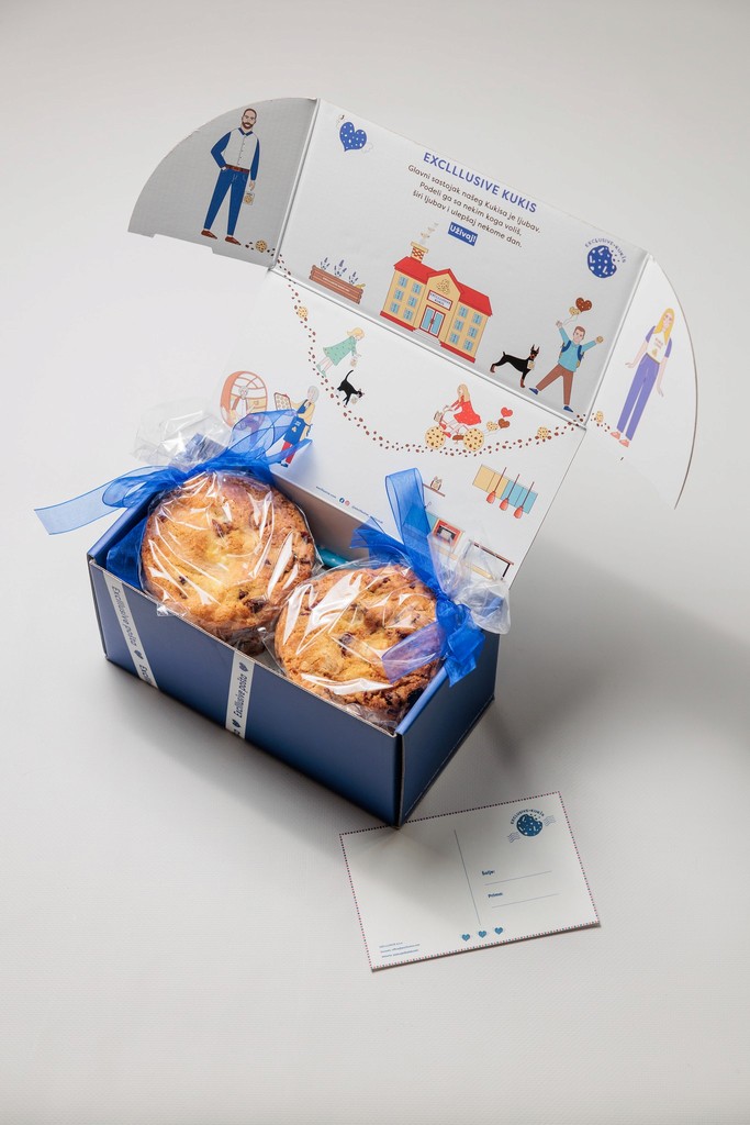
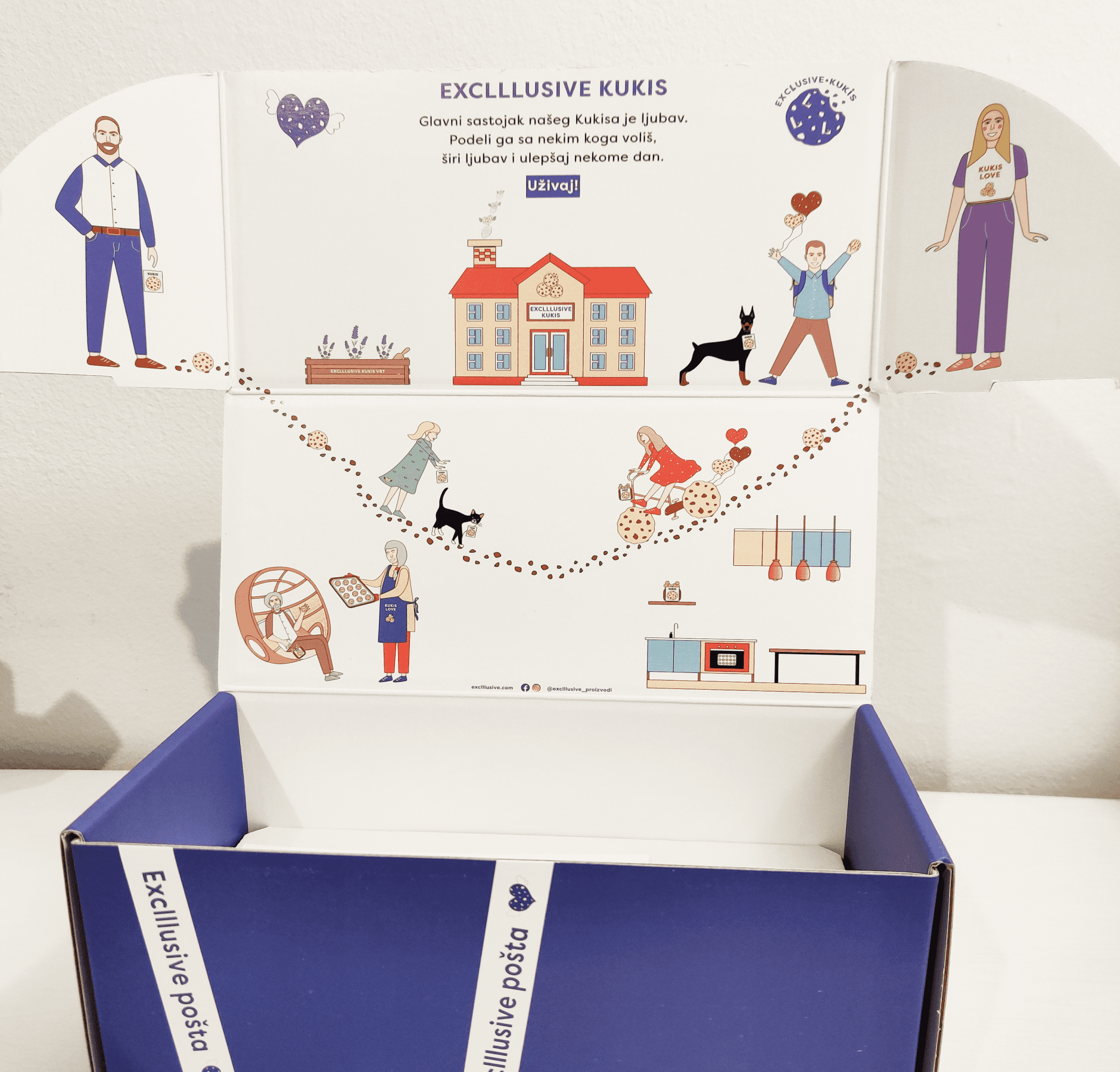
ILLUSTRATIONS INSIDE THE BOX
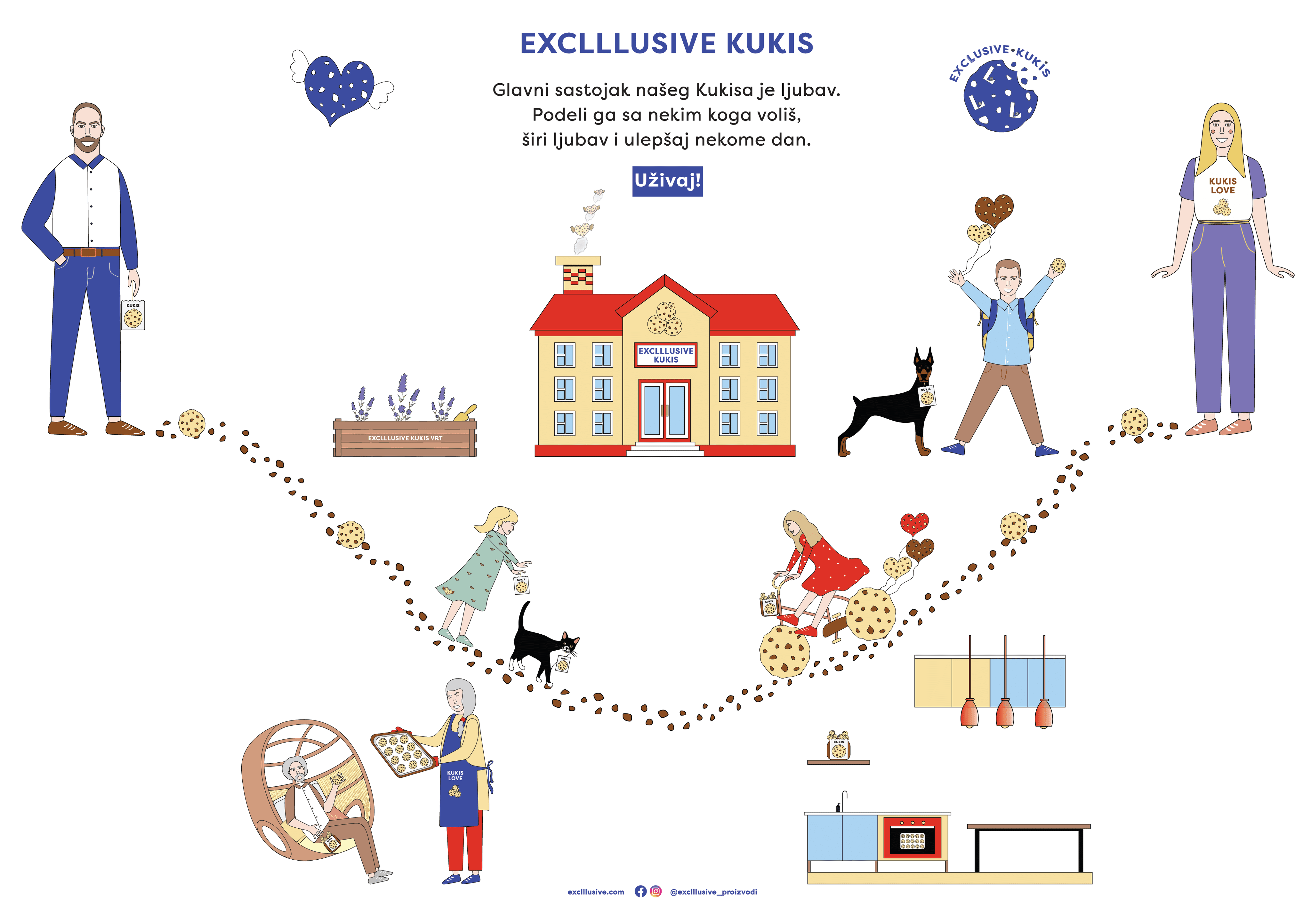
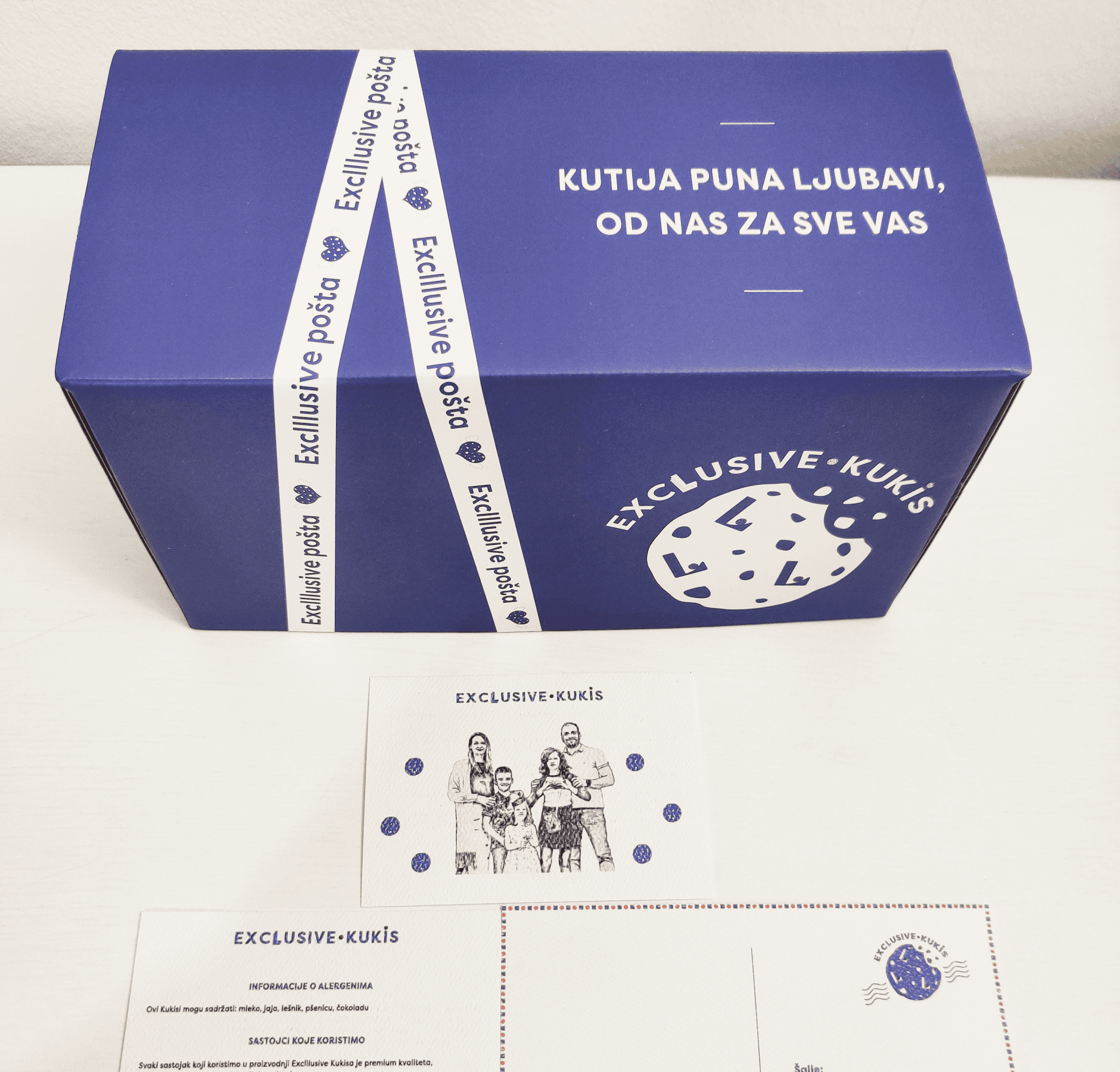
The idea was to present a heartwarming & joyful story about homemade cookies who gather families together
In the Balkan cookies ("Kukis” in Serbian) are associated with childhood memories & aromas that filled grandma's houses
The family consists of mom, dad, 3 kids, grandpa, grandma, a dog & a cat - all gathered around the school where Kukis are baked
Passed down through generations, these traditional recipes have become a symbol of family gatherings

VISUAL STORYTELLING THROUGH ILLUSTRATIONS
A WARM STORY ABOUT FAMILY WHO MAKES HOMEMADE COOKIES
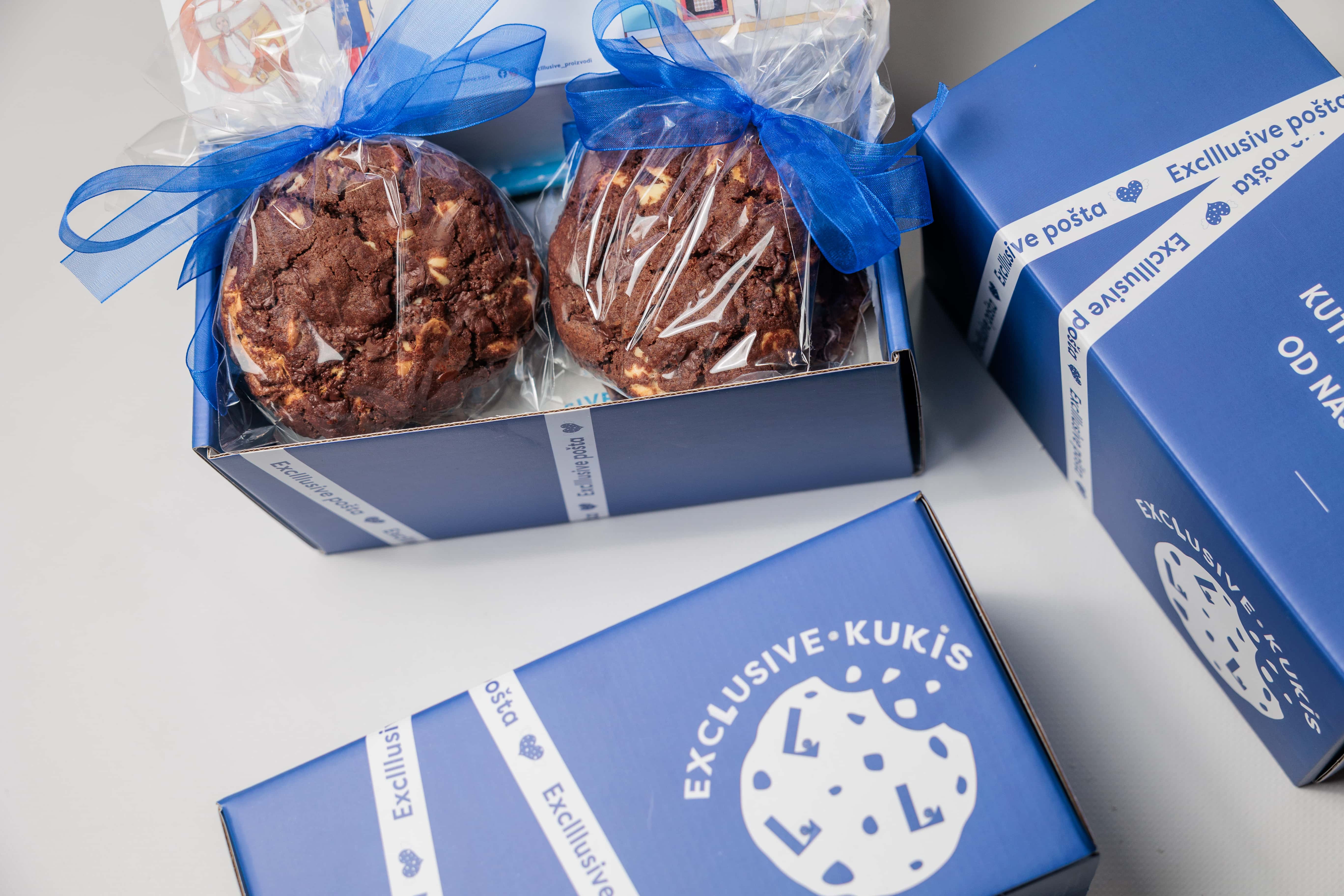
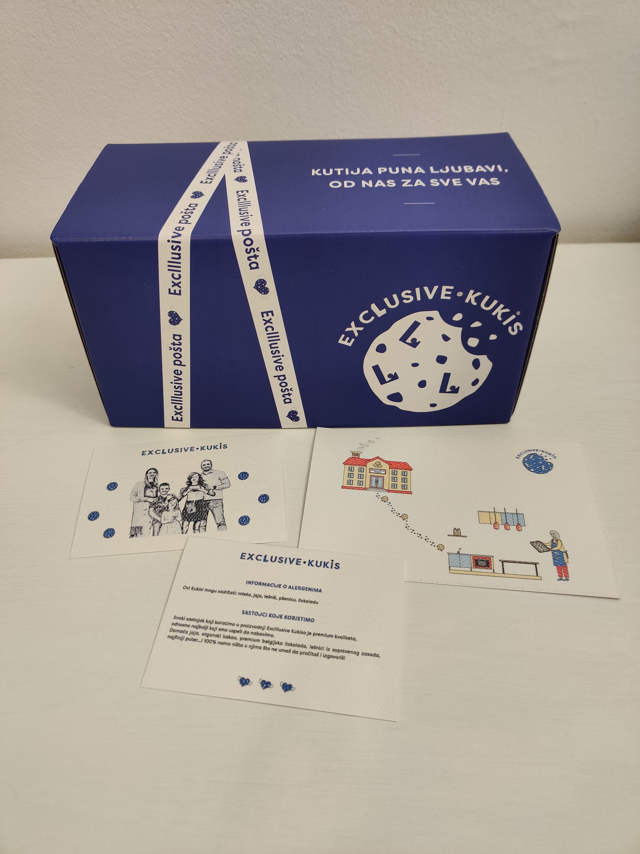
THE BRAND EXCLLLUSIVE
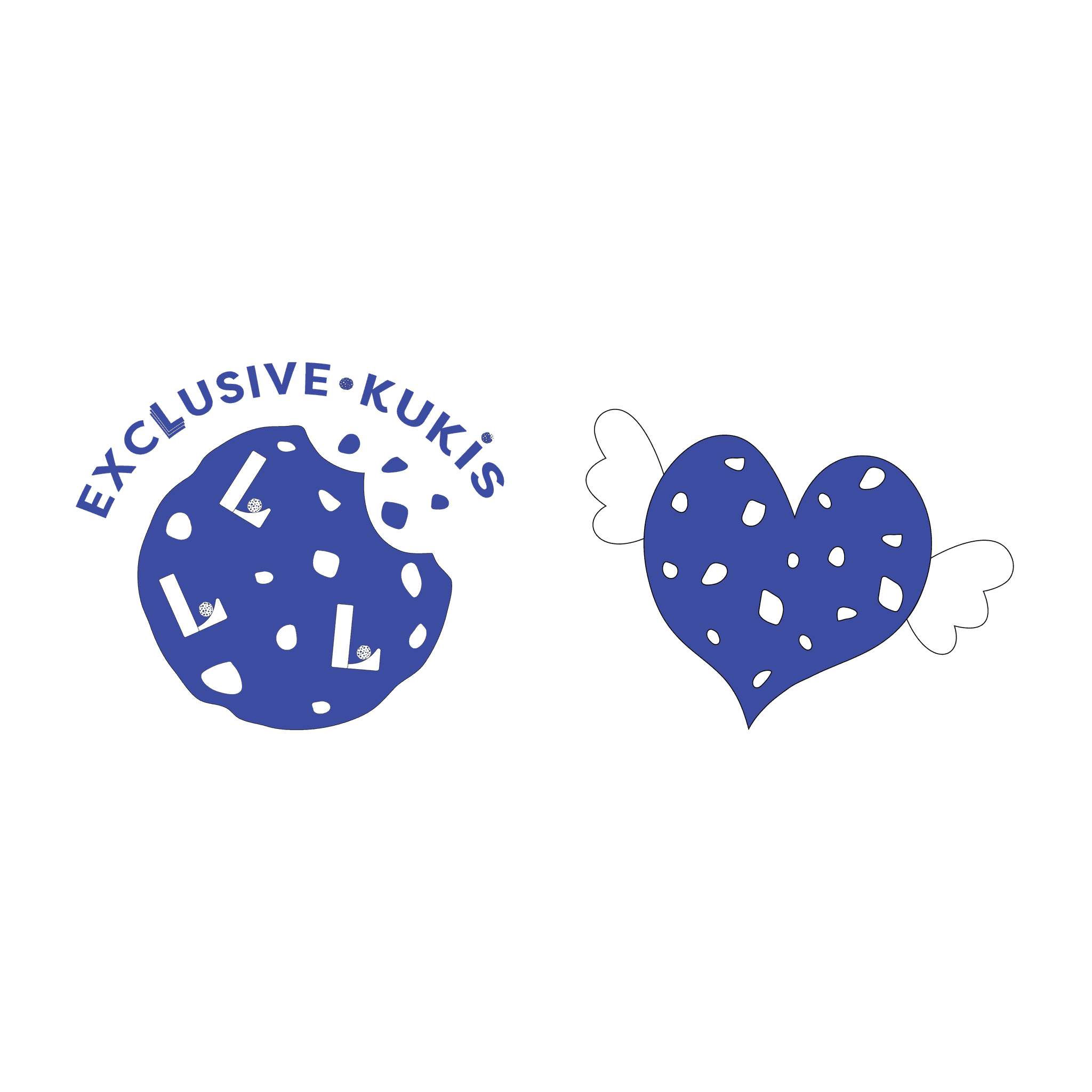
The name "Exclllusive" holds a special significance, with the three letters "L" representing the first initials of the family's kids - Lana, Luka & Lara
That's why "L's" are stacked on top of each other, and crafted into a cookie-shaped logo, becoming the heart of the brand identity
The brand's tone is oriented toward family, coziness, sharing, warmth & joy
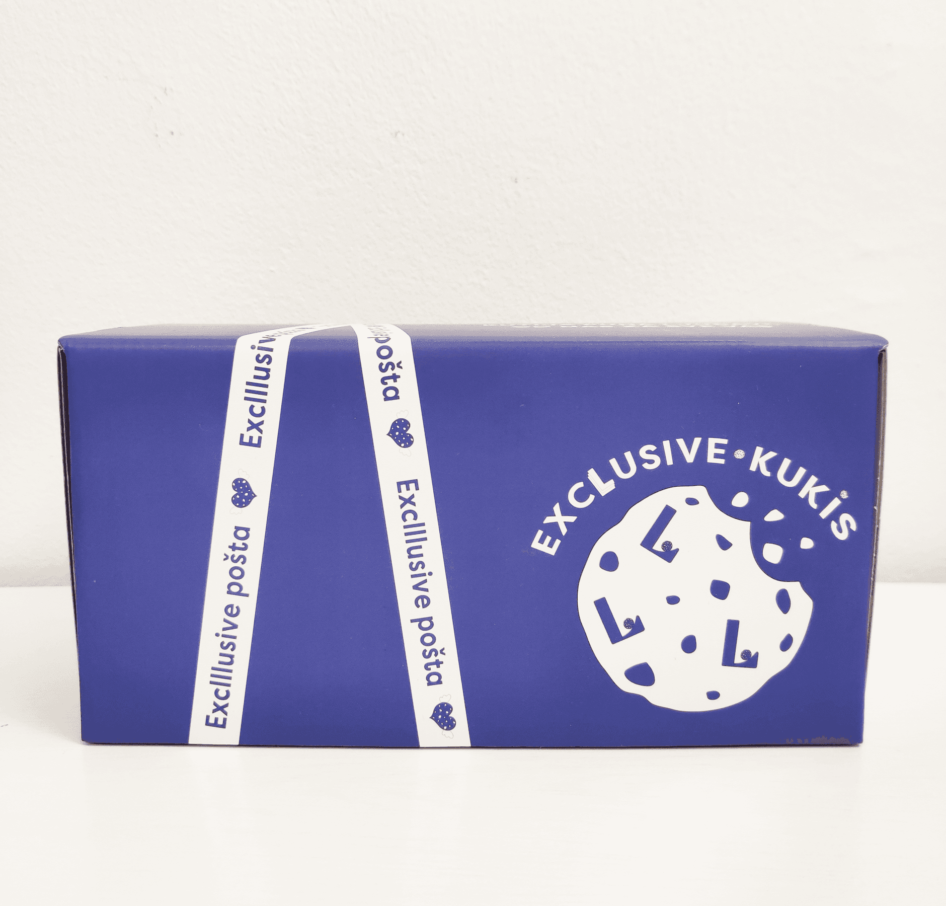

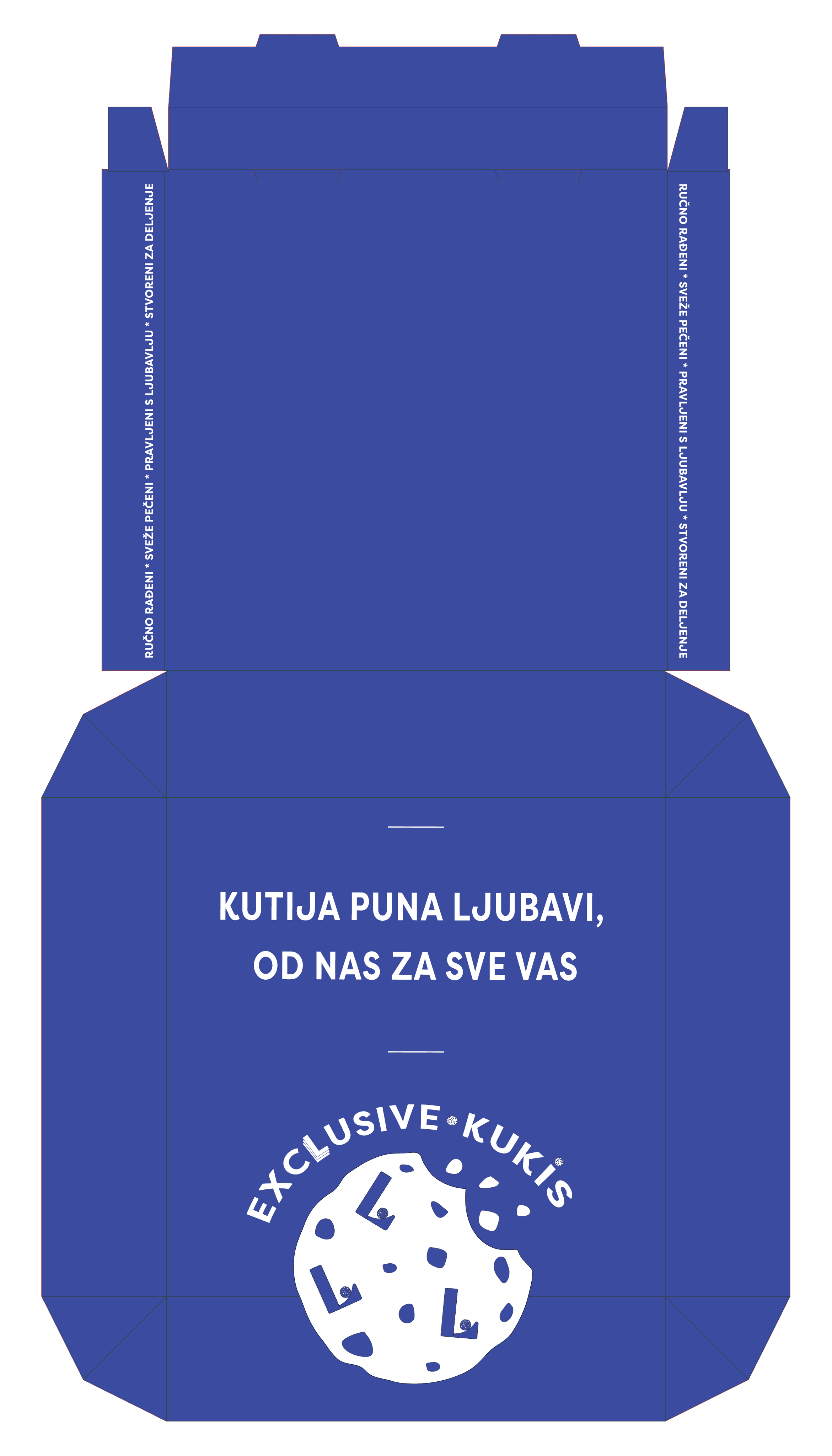
1) COOKIES PACKAGE DESIGN
New Brand Identity
Visual Storytelling
Character Illustrations
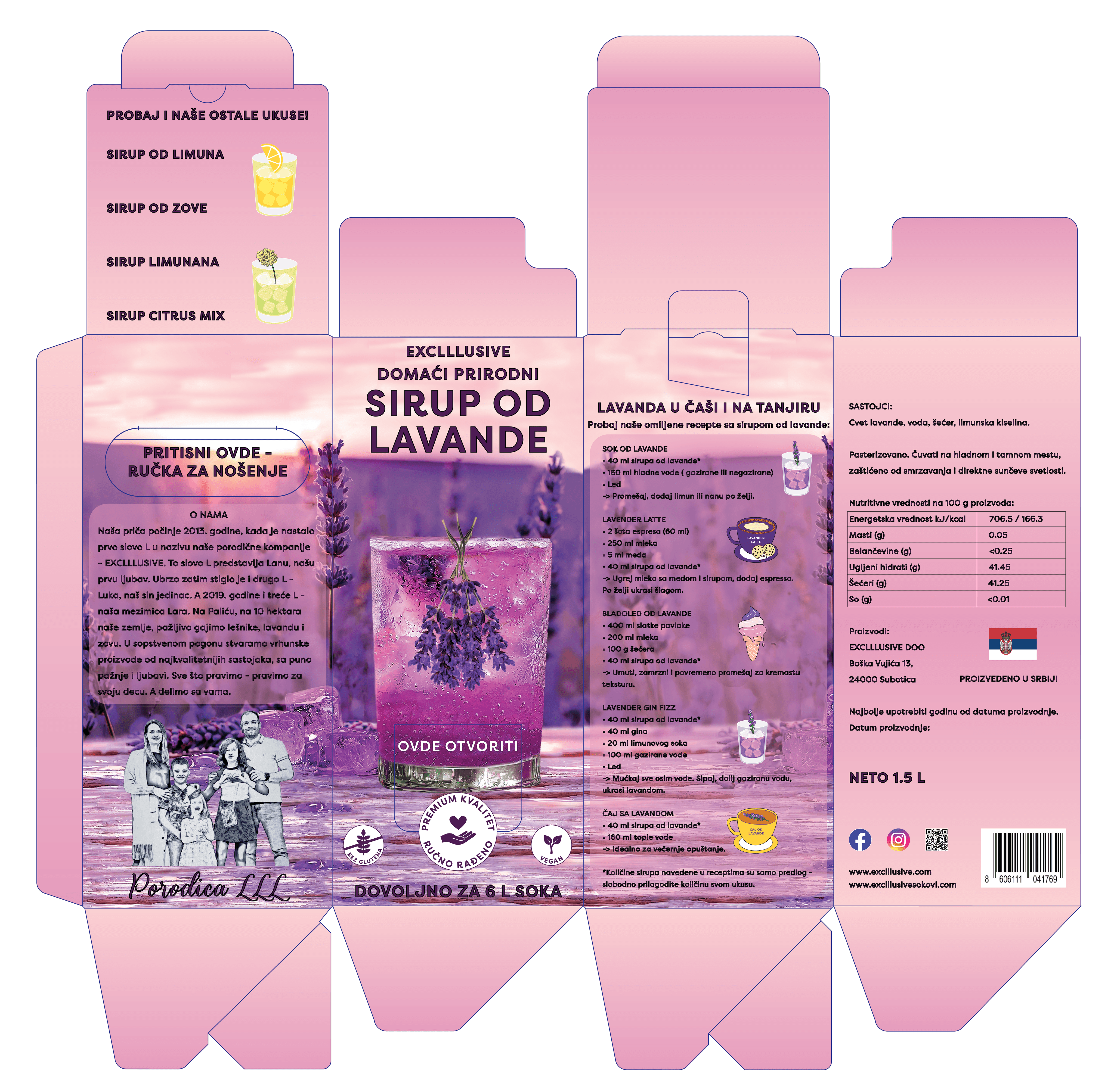
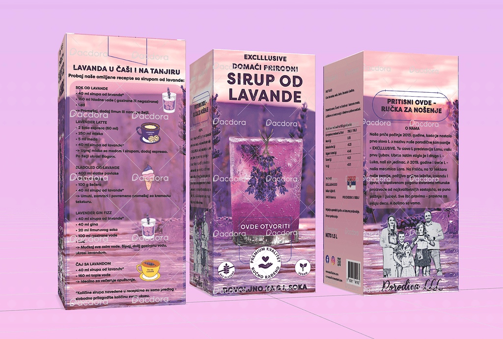
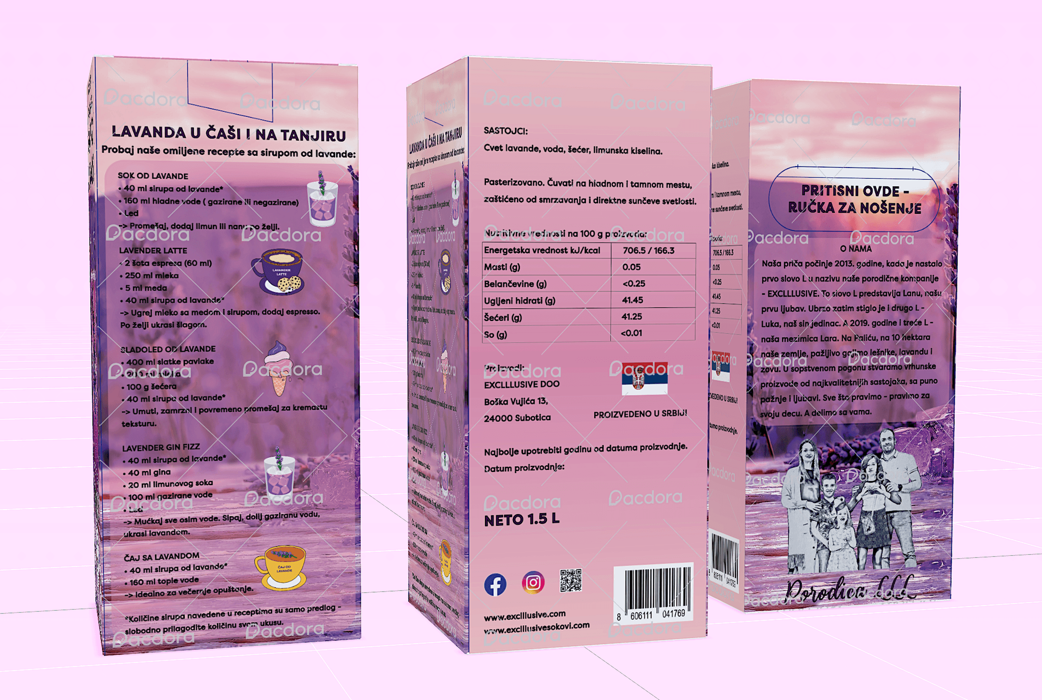
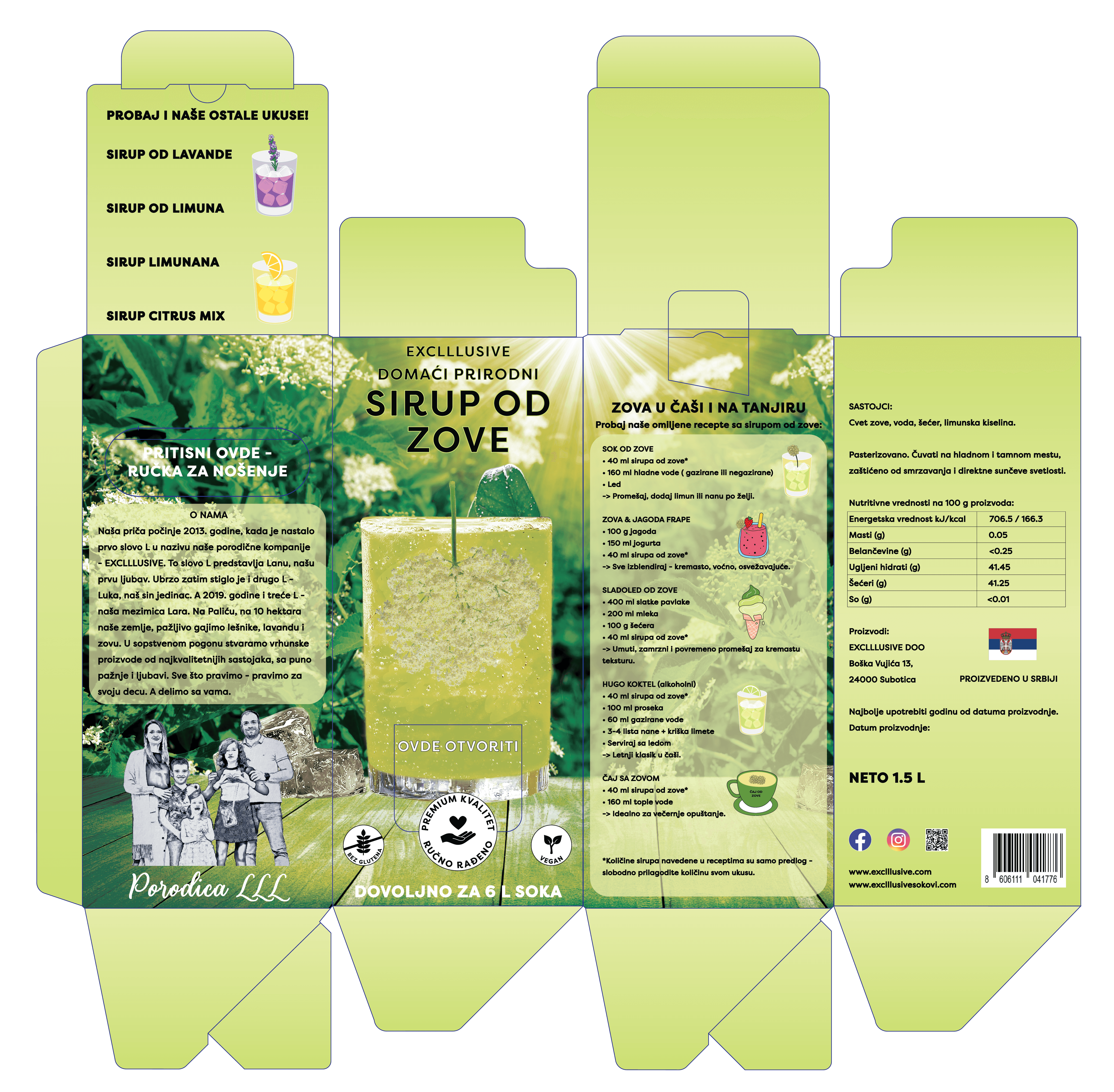
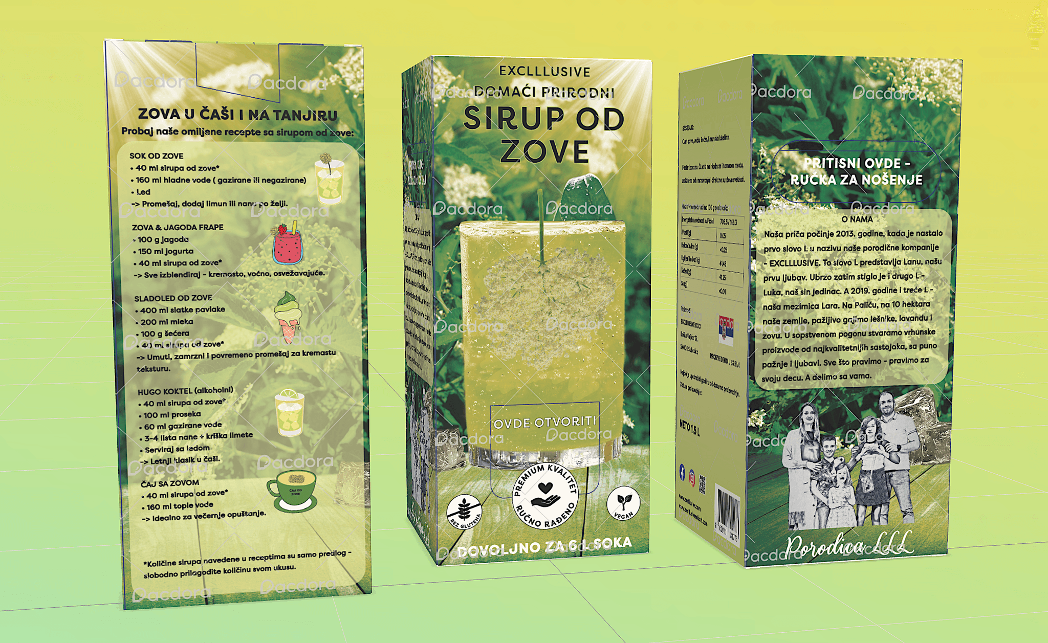
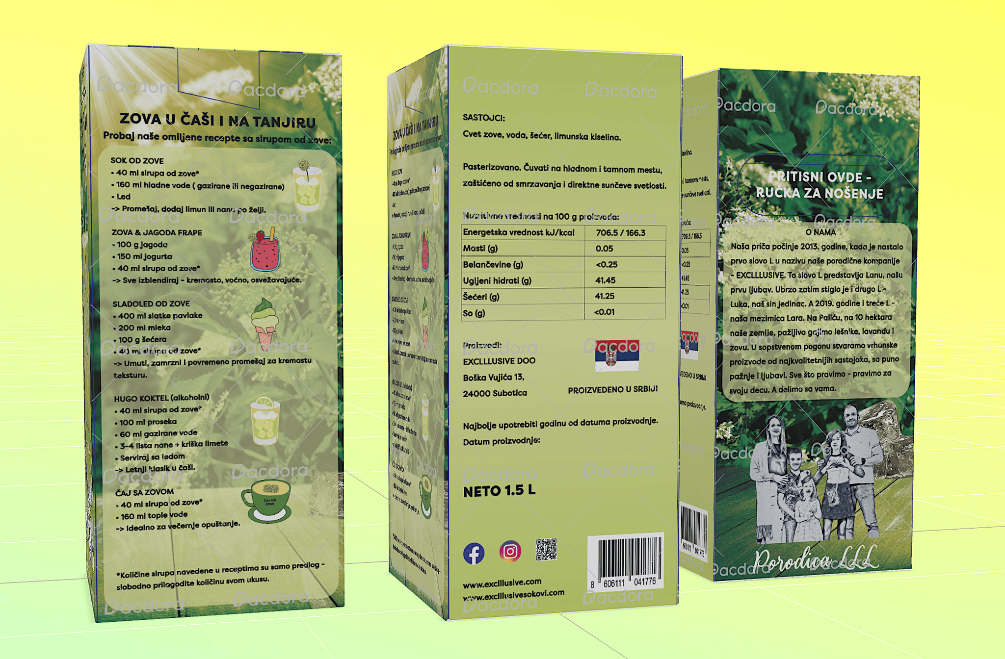
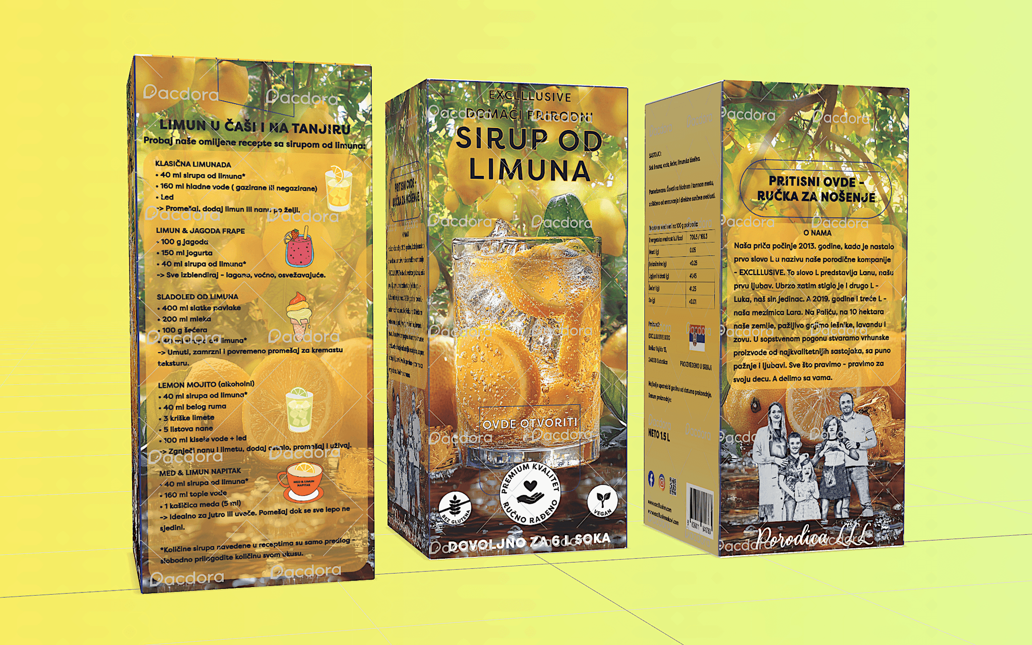
2) SYRUPS PACKAGE DESIGN
Premium Package Design
Storytelling
Digital Illustrations
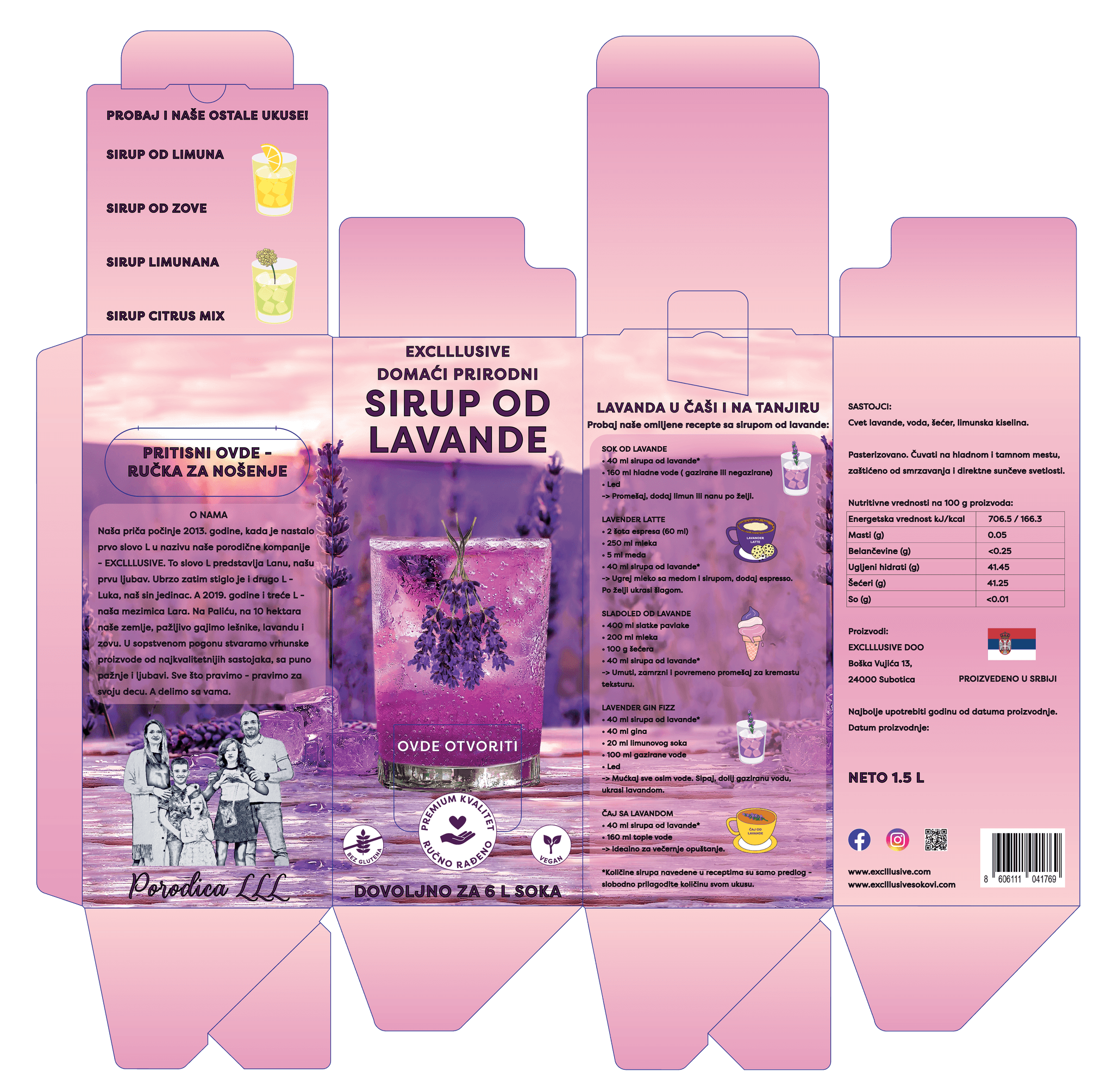
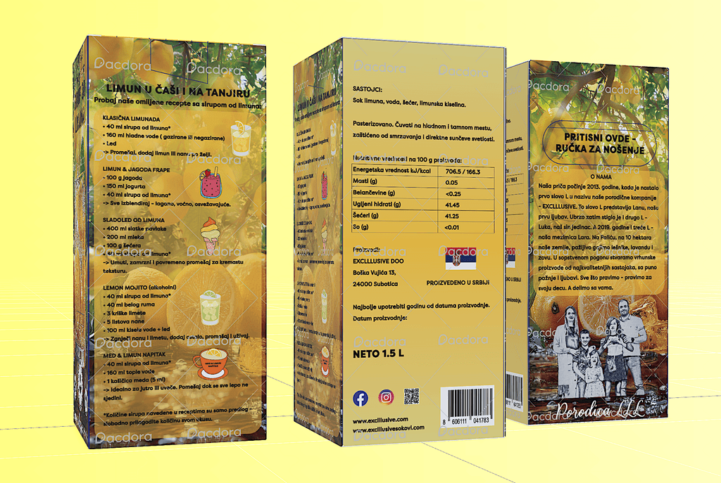
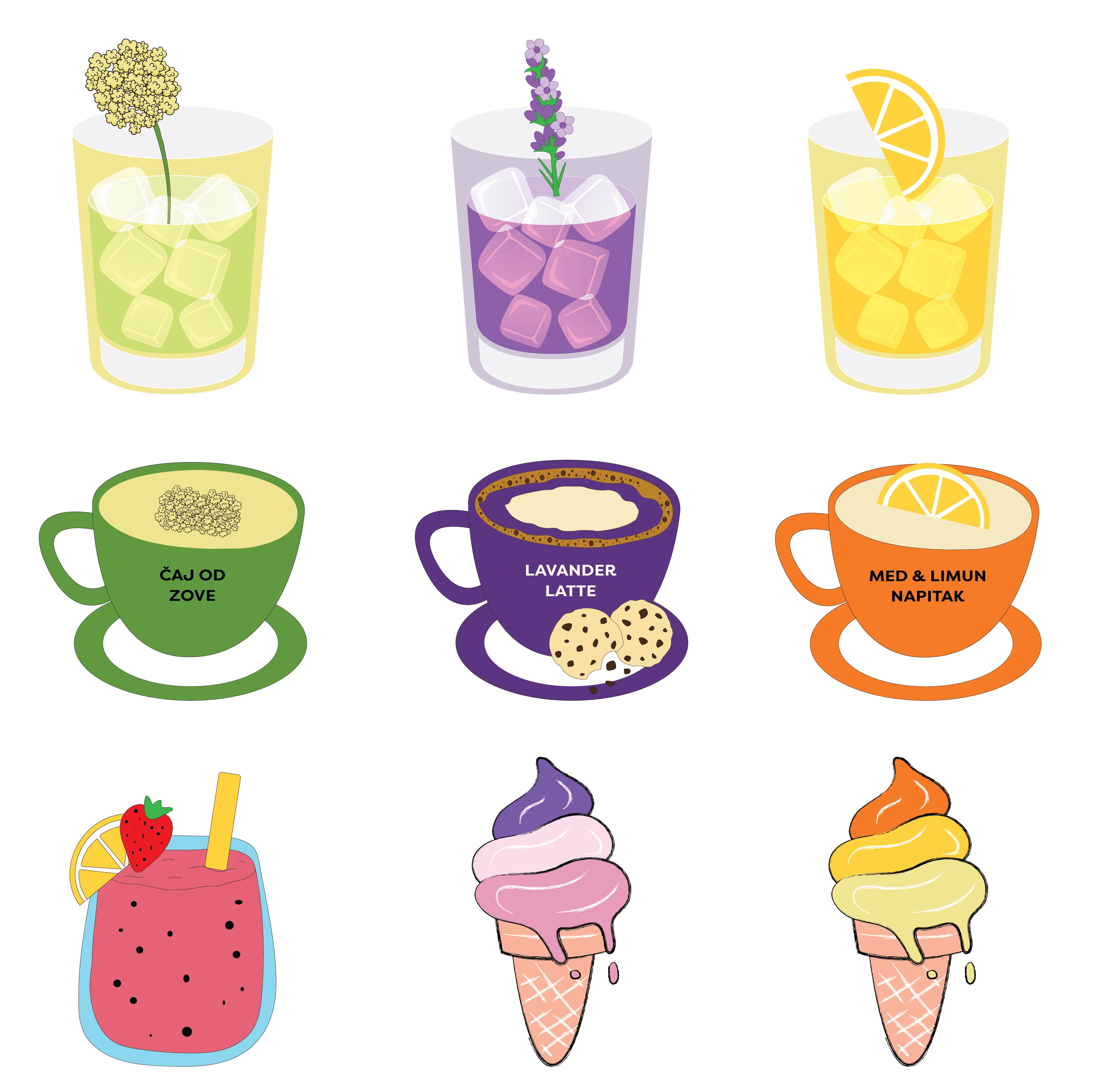
HOMEMADE LAVENDER SYRUP
HOMEMADE ELDERBERRY SYRUP
HOMEMADE LEMON SYRUP
DIGITAL ILLUSTRATIONS USED ON PACKAGES
3) CHILDREN'S ART BOOK
Autobiography
Narrative Storytelling
Digital Illustrations
OVERVIEW
This autobiographical Children's Art Book captures my daily life in NYC through playfully illustrated storytelling
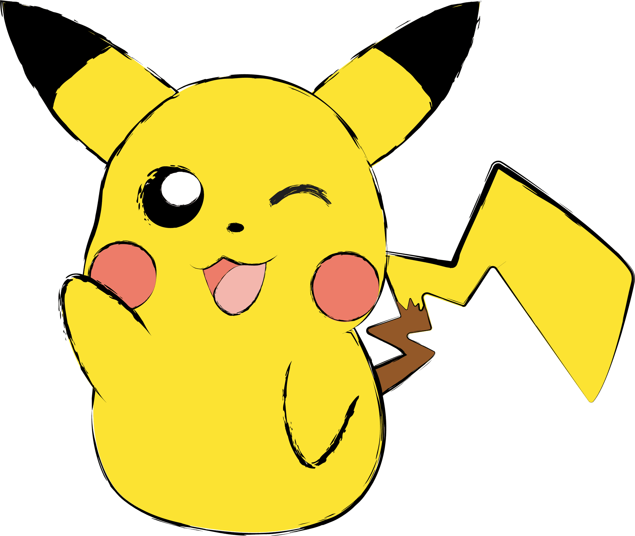
PIKACHU —> the narrative storyteller and protagonist, brings a unique perspective to my daily life routines. Pikachu is illustrated in many different roles - as a full-time student, as an athlete who loves to train, as an individual who's devoted to prioritizing "me-time" and mental health, etc.
My goal was to combine autobiography, storytelling & visual design, creating a unique blend of narrative & creativity
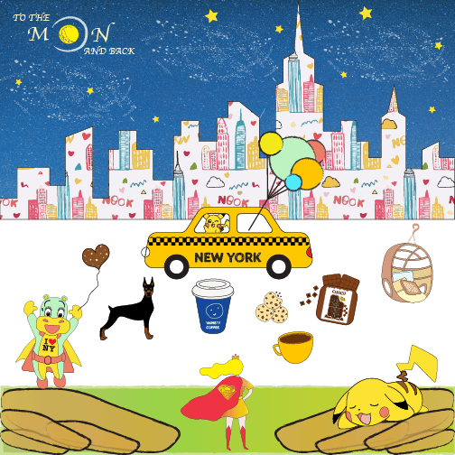
Mood board as an inspiration
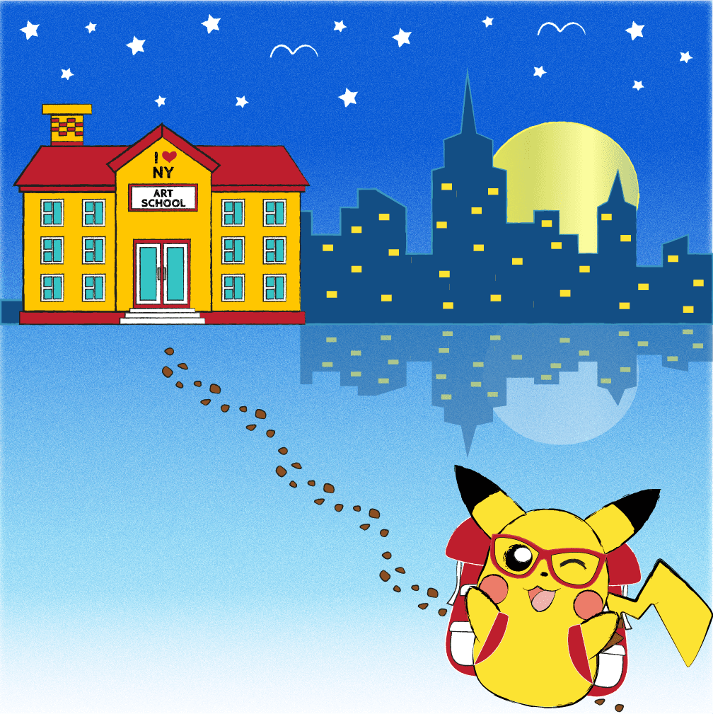
MON - going to school to study
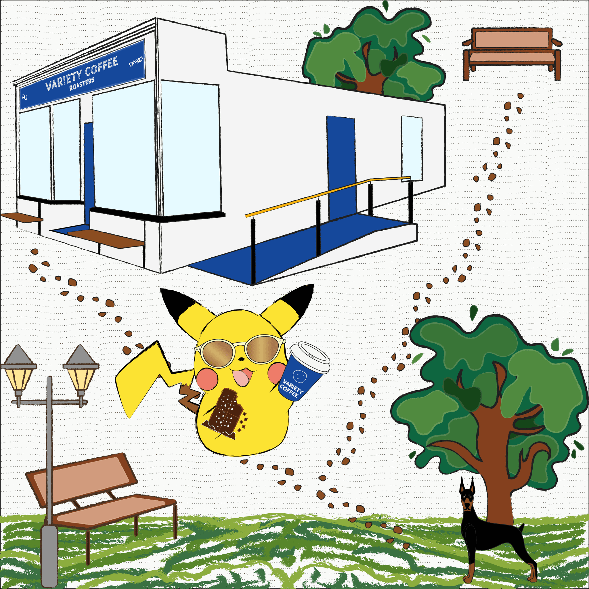
TUE -enjoying the #littlethings in the favorite park
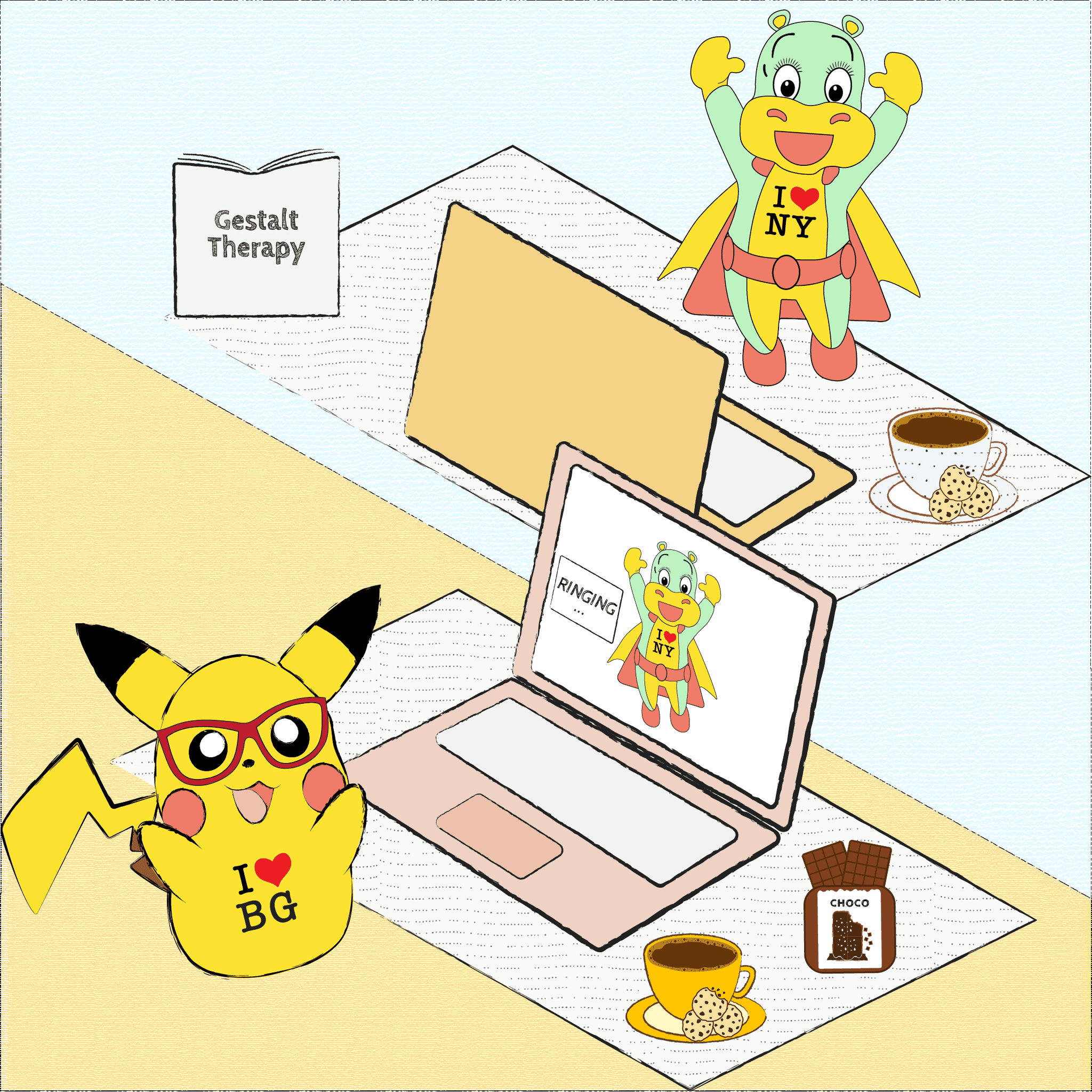
WED - prioritizing self-care,
online Therapy sessions
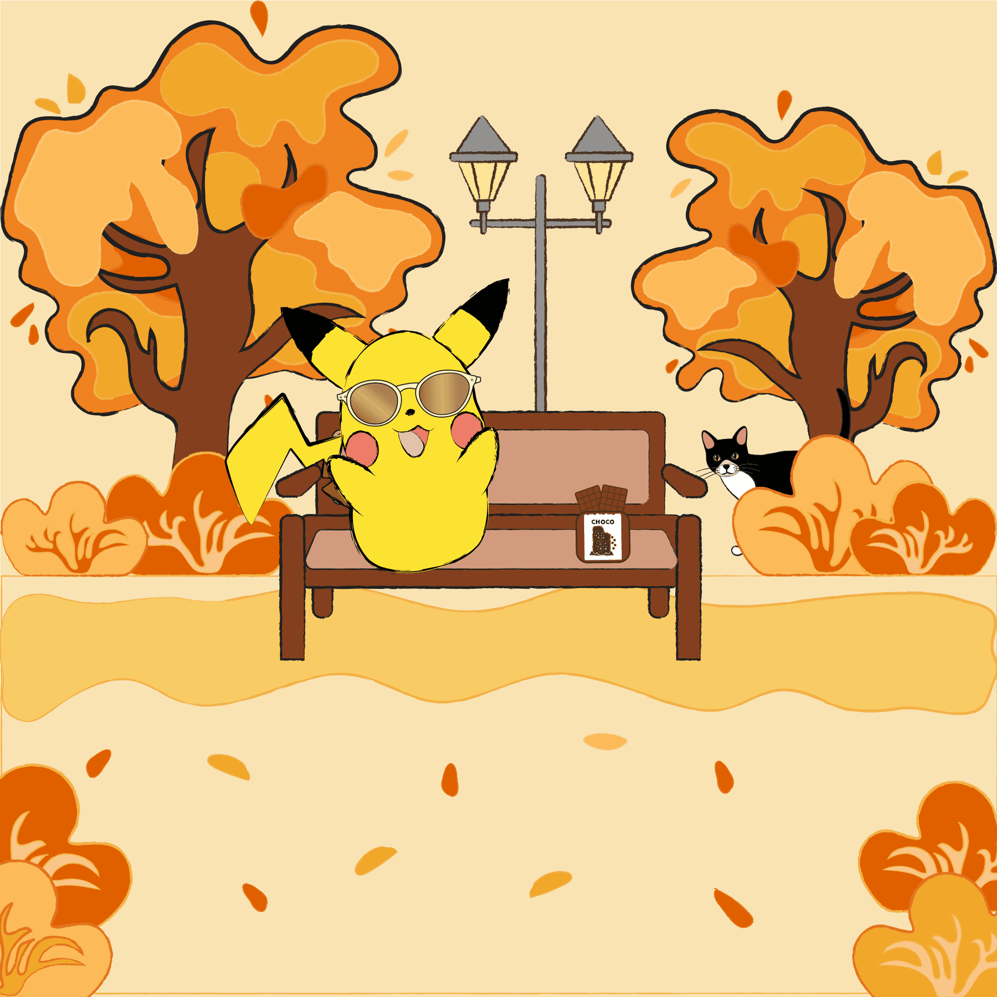
THU - hanging with friends before going to school & work
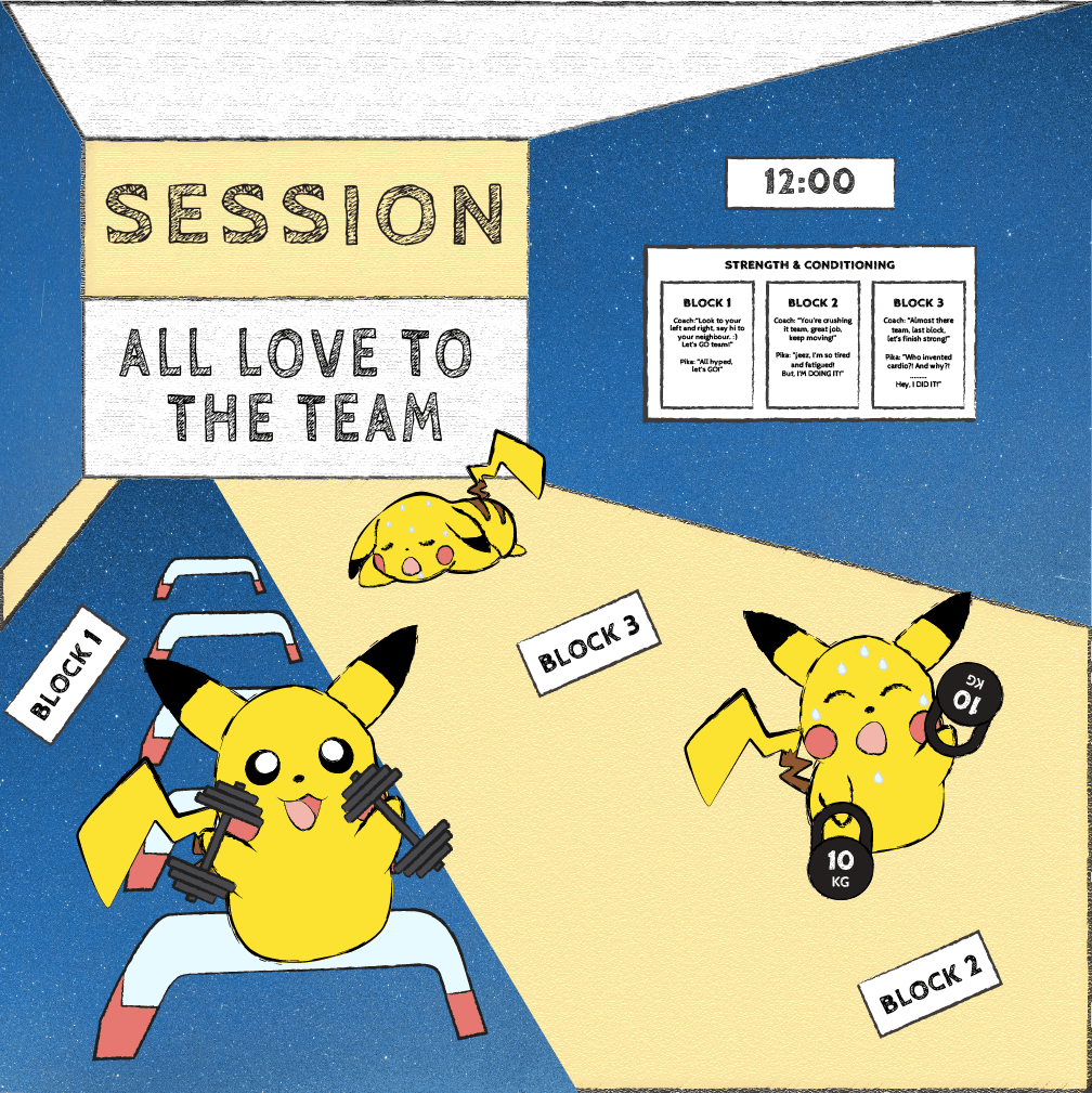
FRI - training in the gym with the most supportive community
LOGO DESIGN
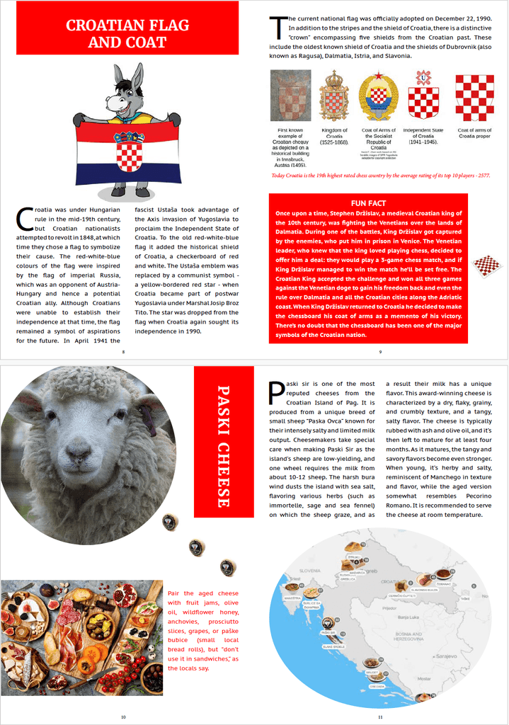
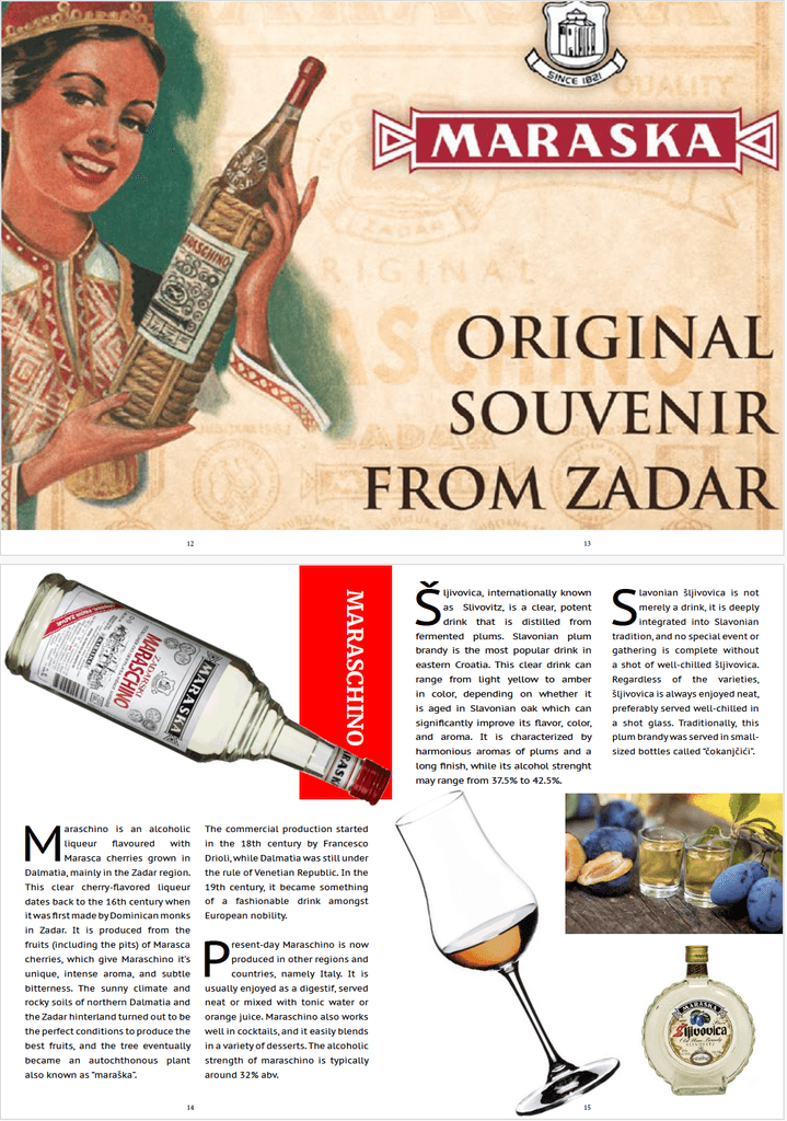
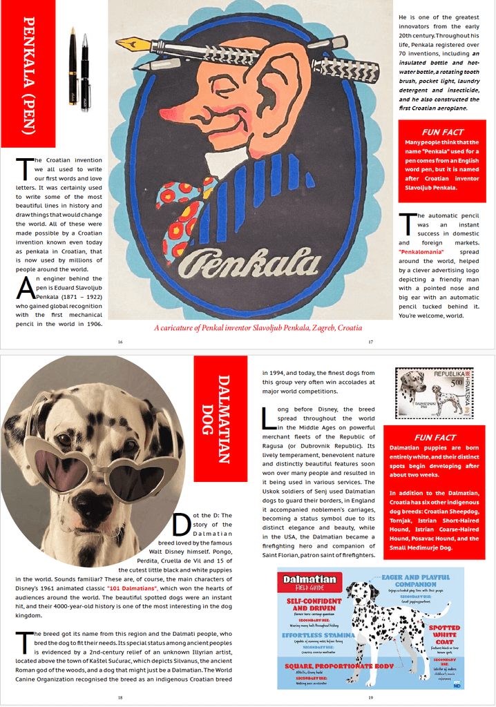
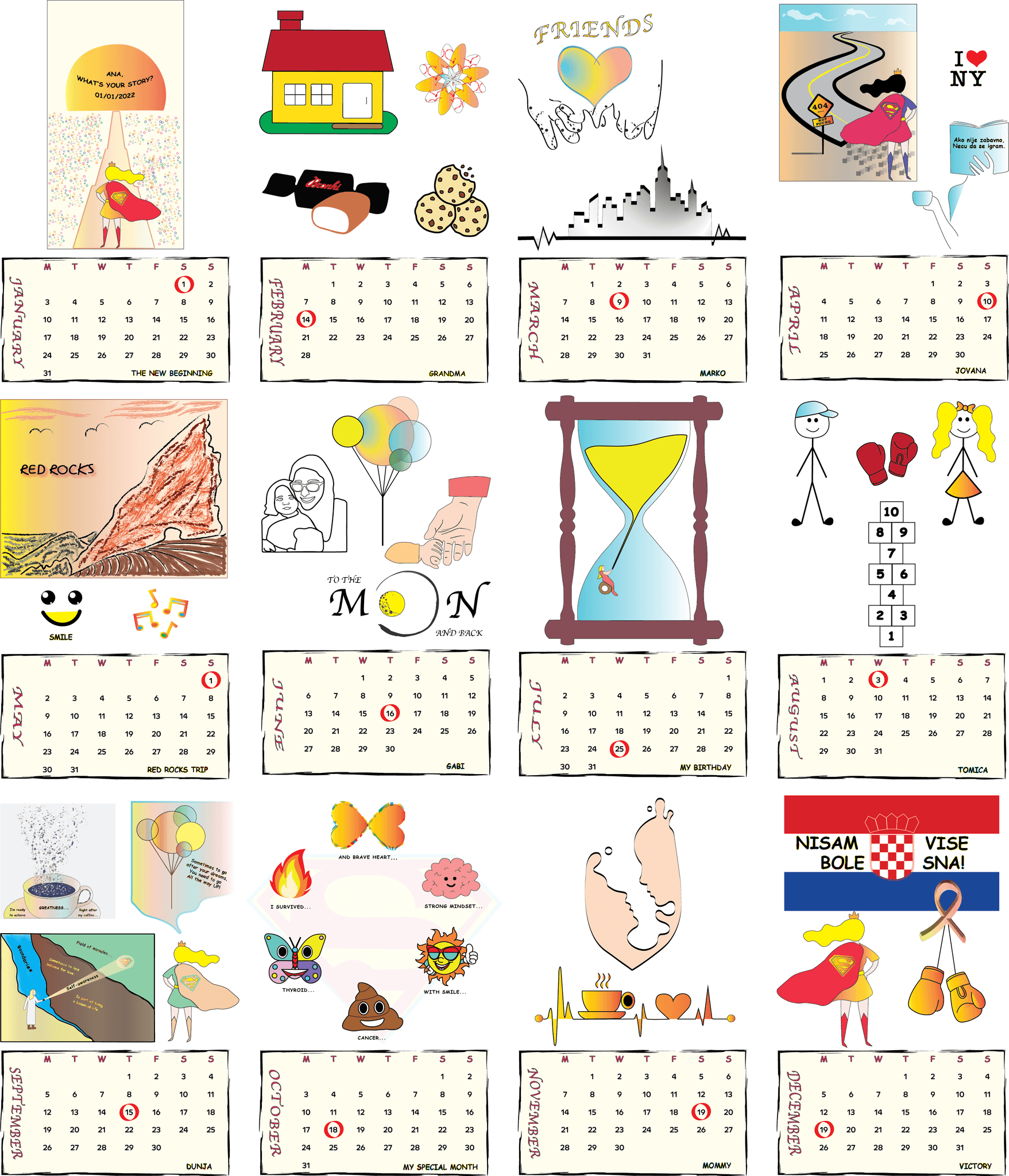
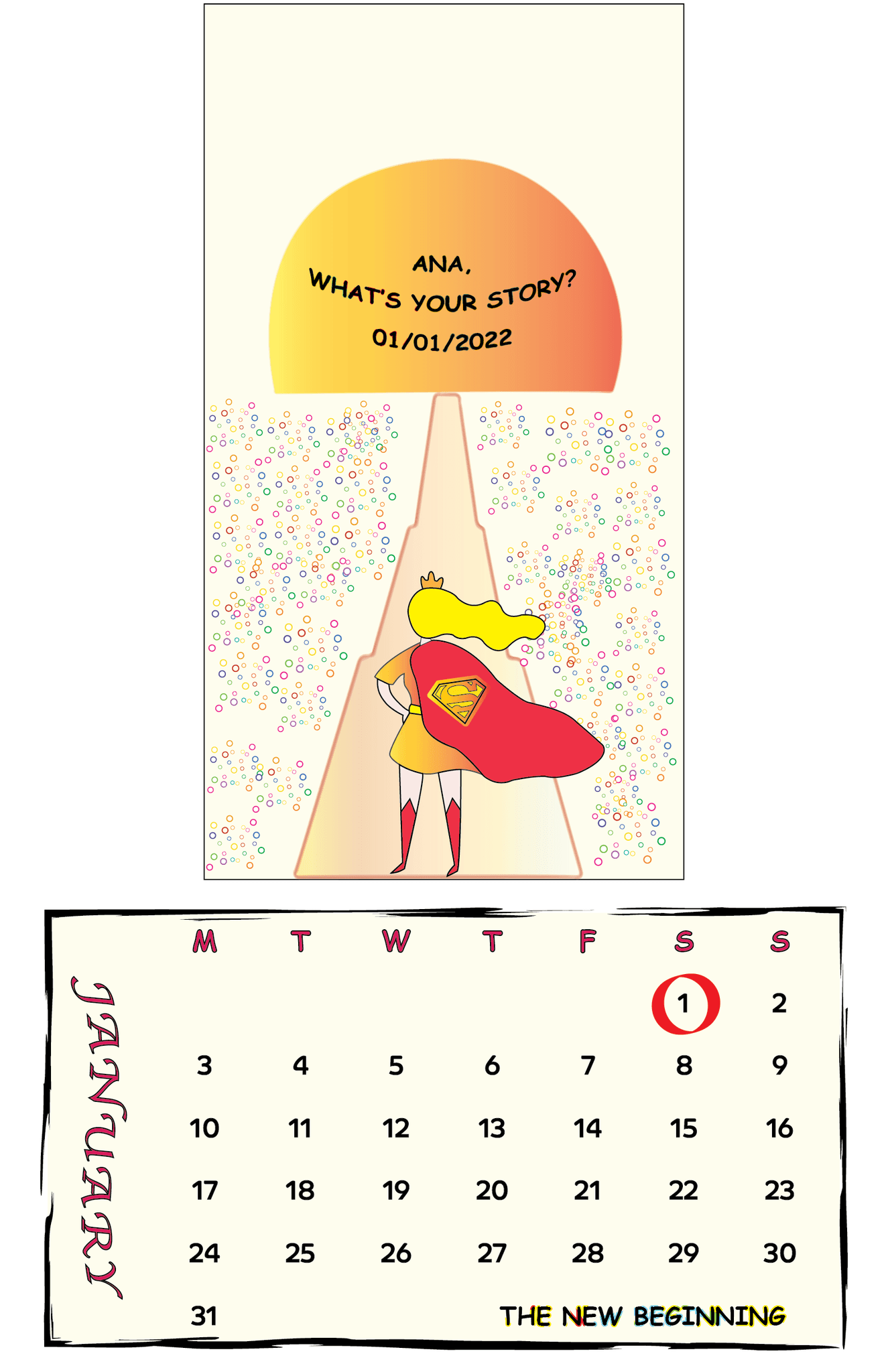
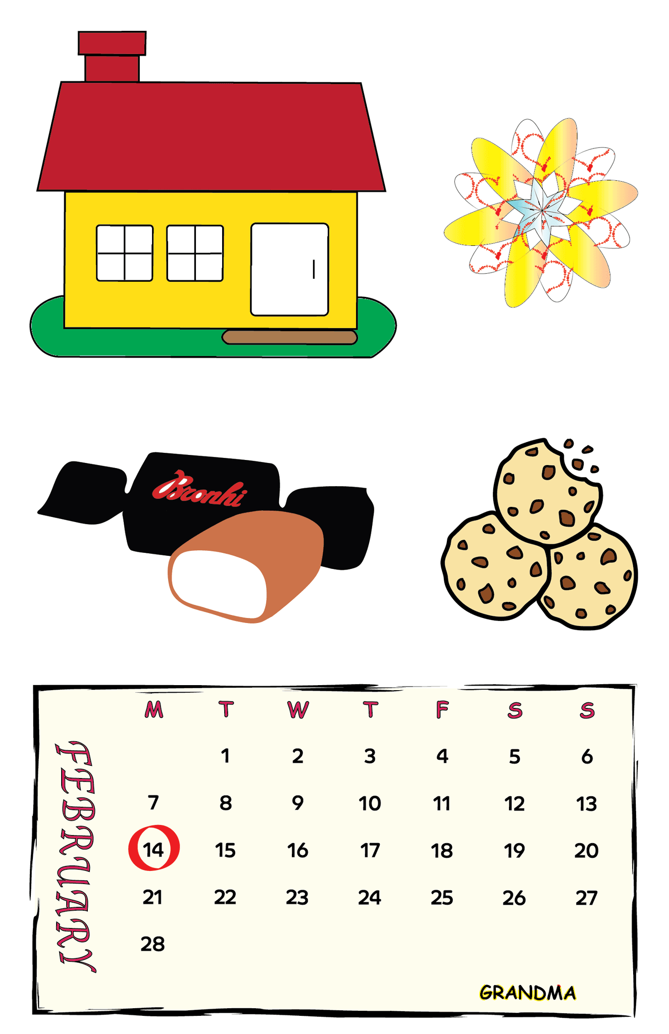
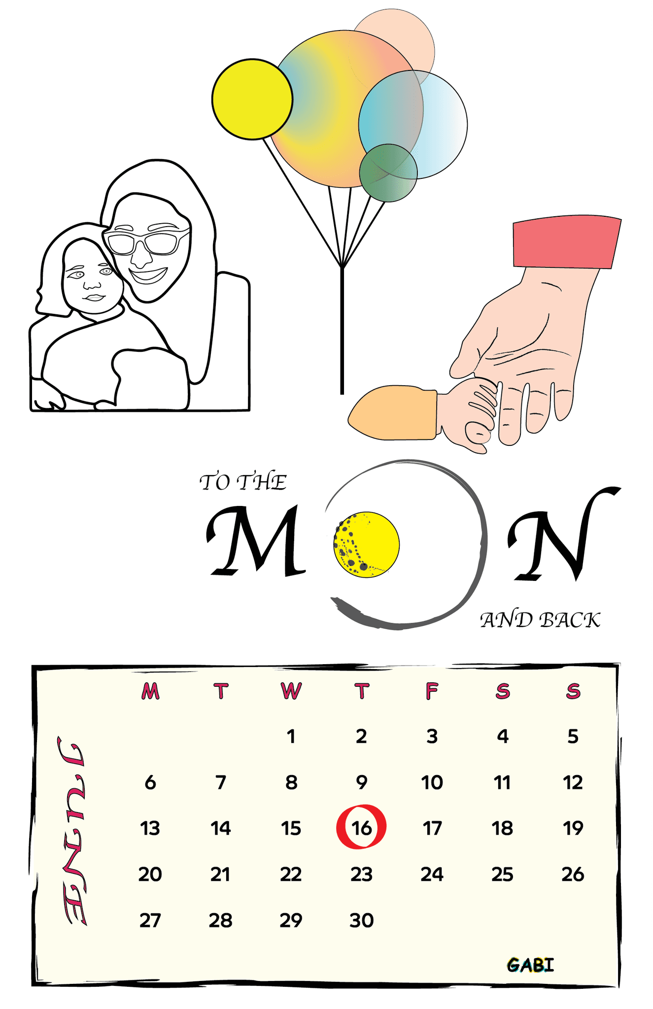
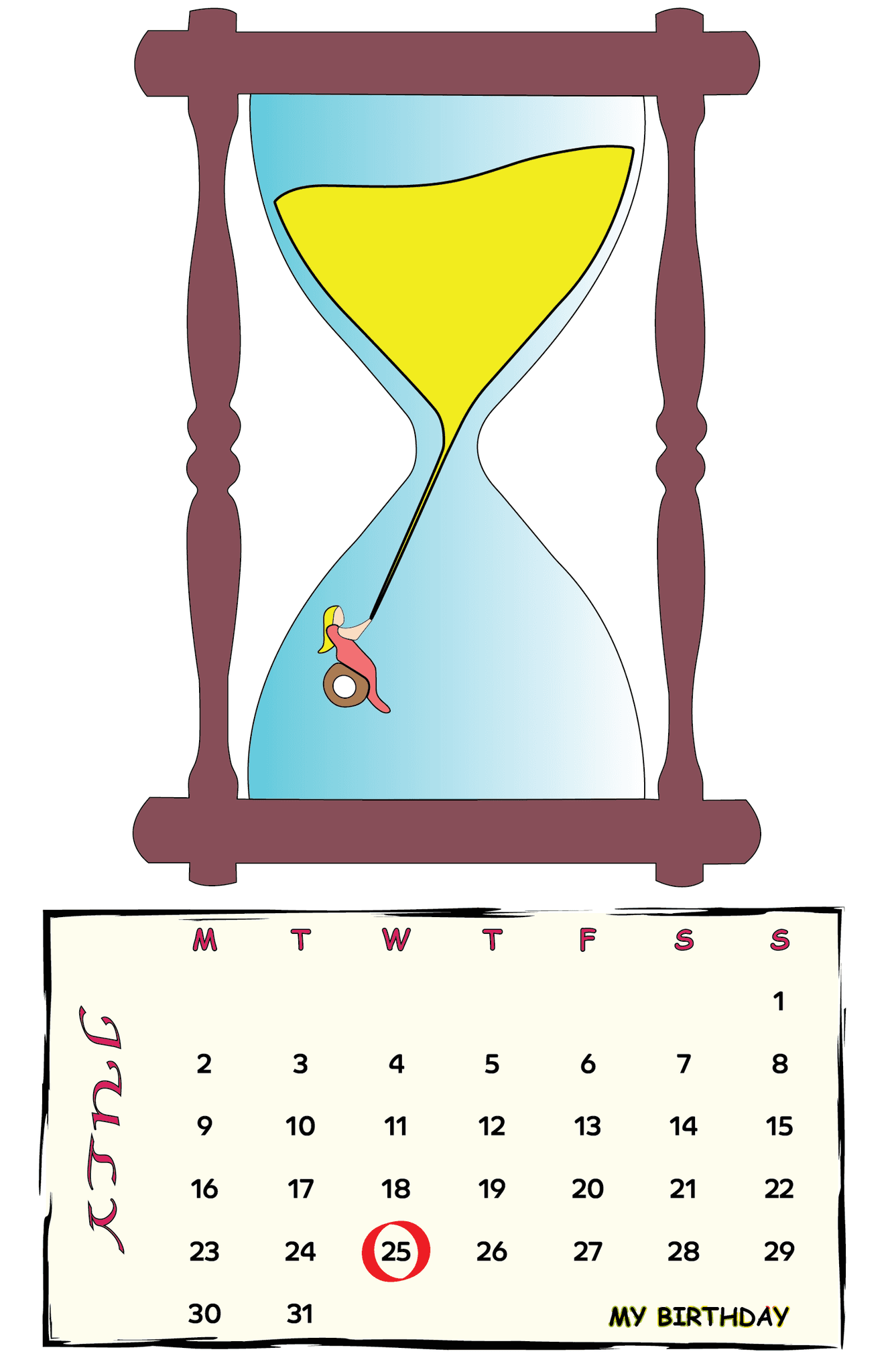
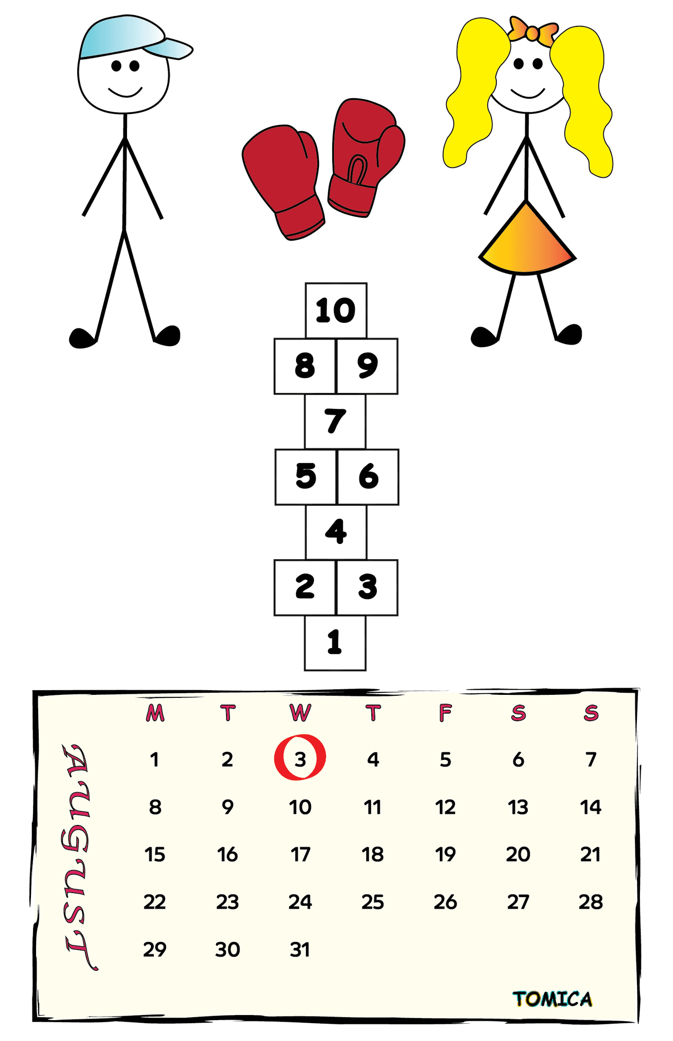
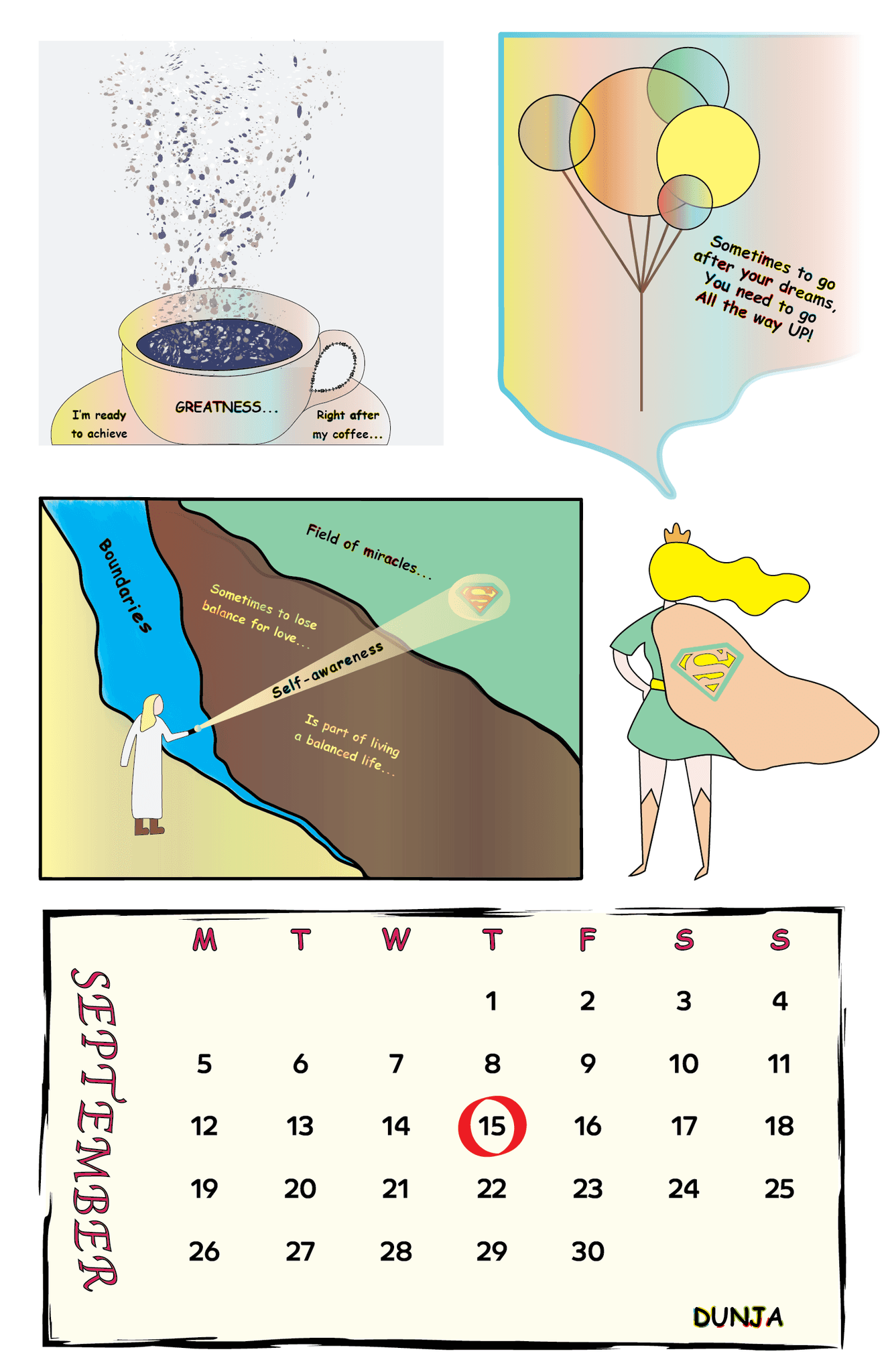
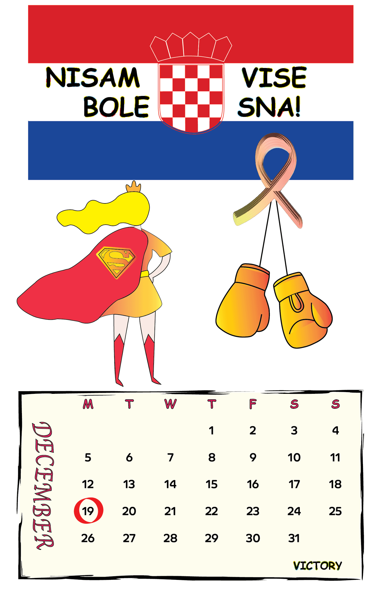
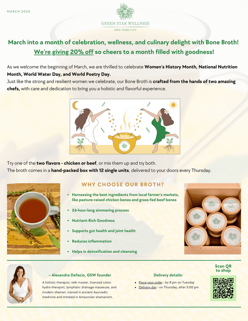
MAGAZINE, CALENDAR & NEWSLETTER DESIGN
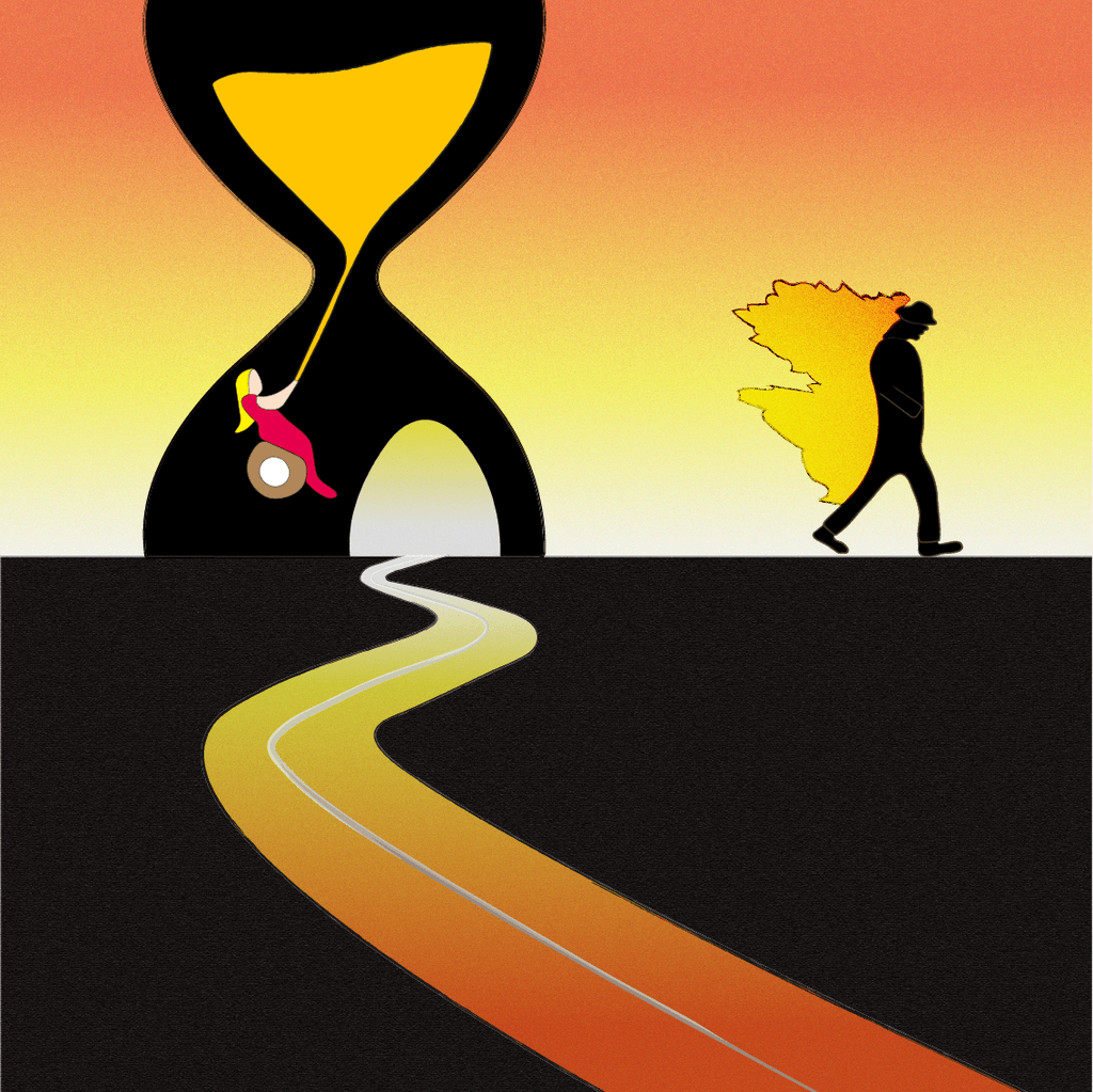
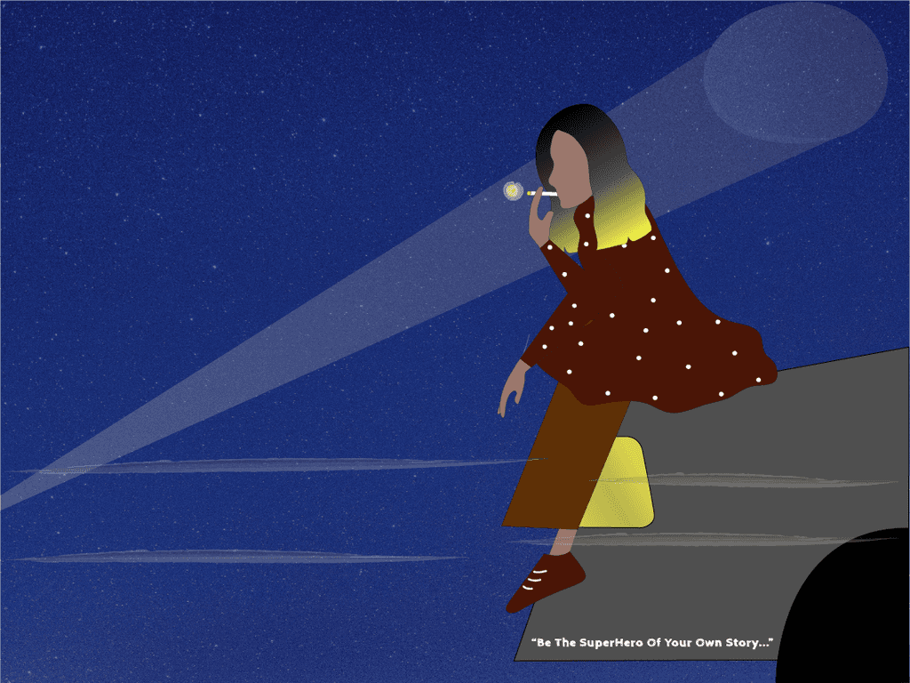
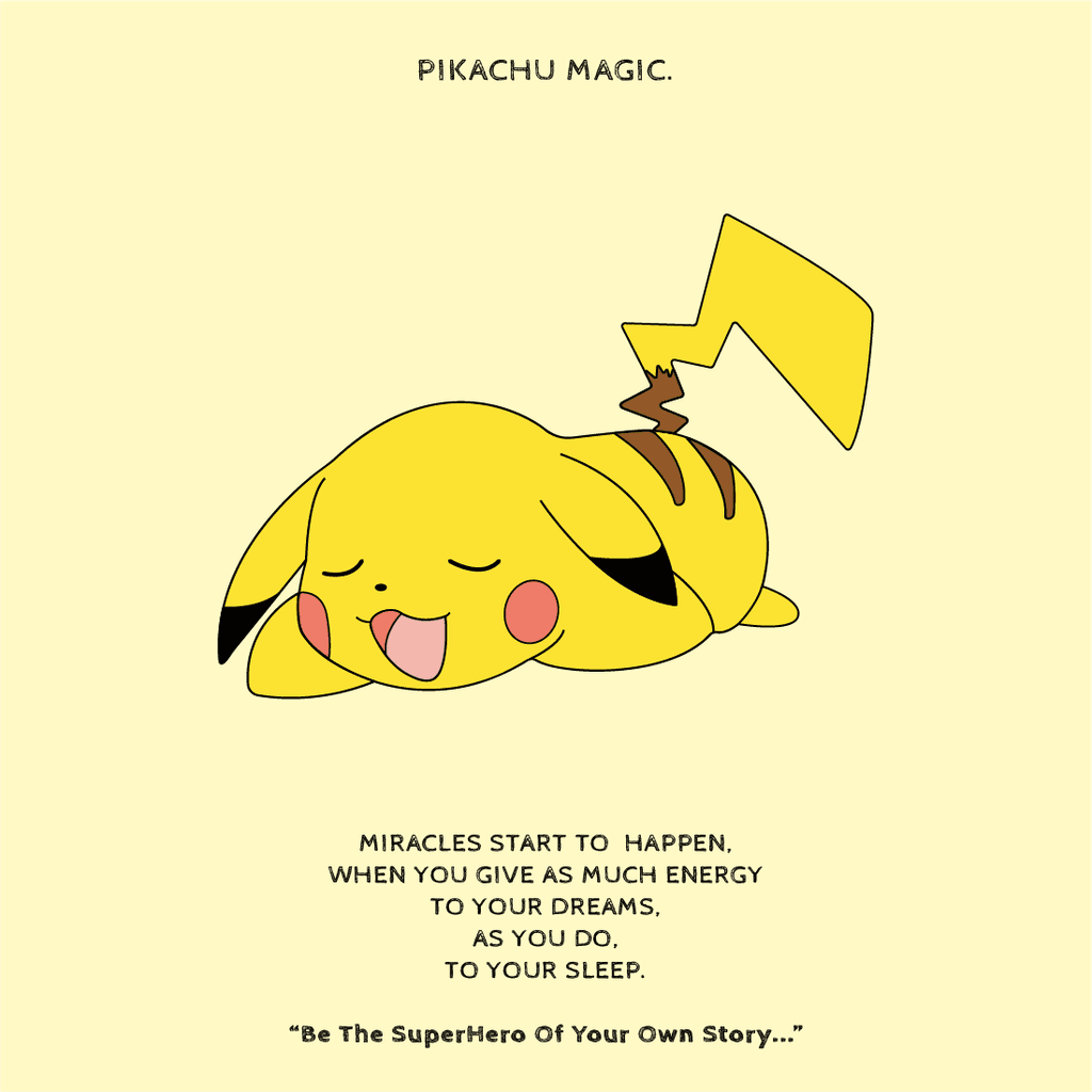
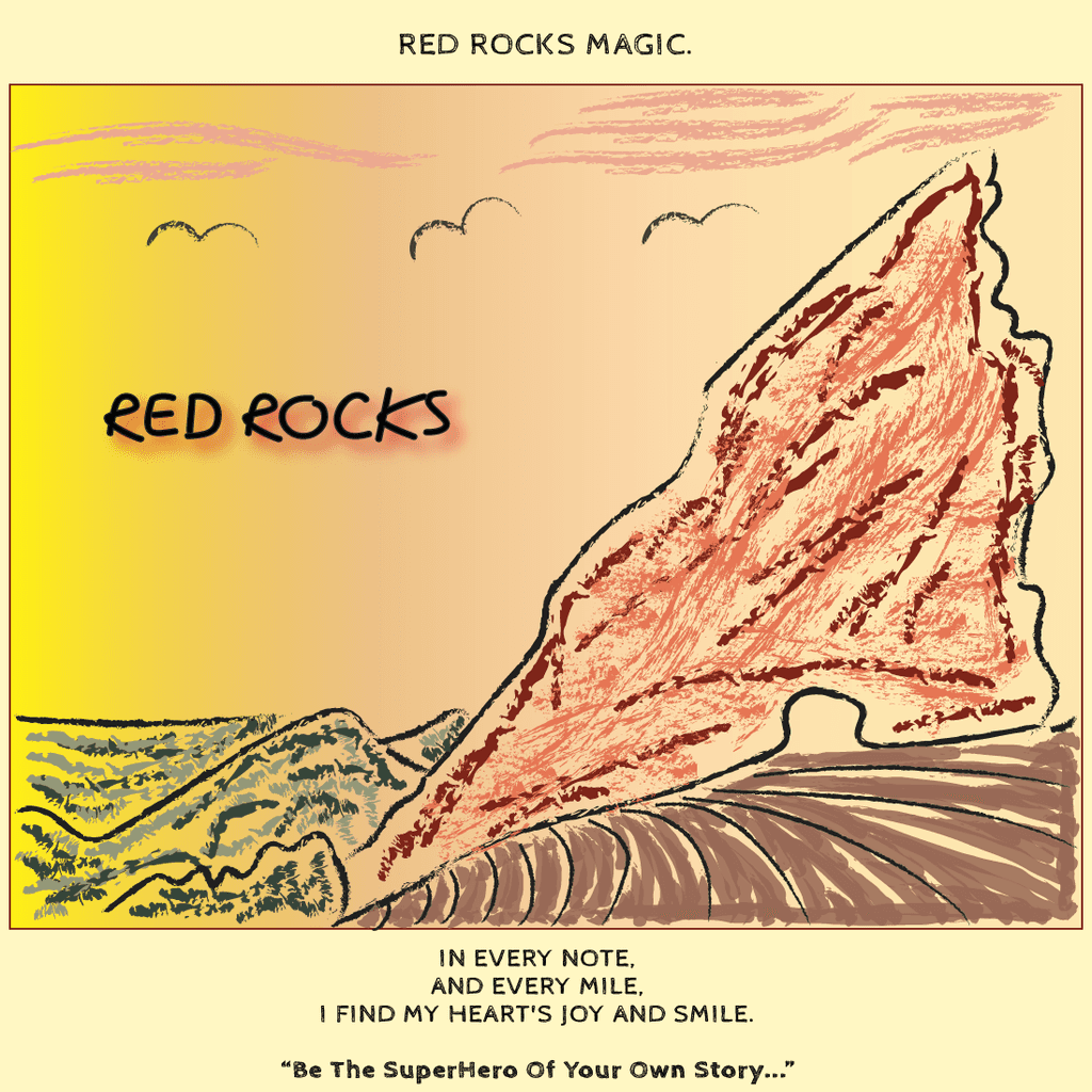
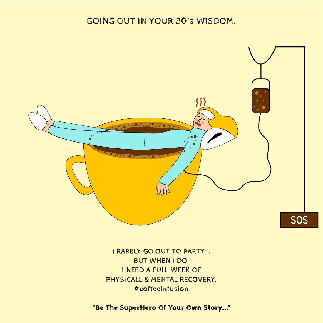
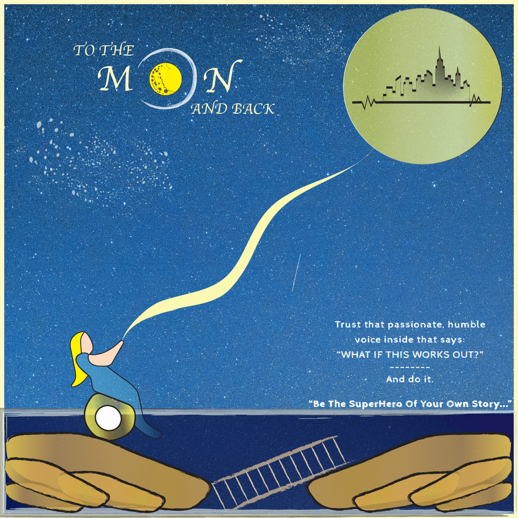
4) VISUAL STORYTELLING THROUGH ILLUSTRATIONS
WHAT I'VE LEARNED
That I love supporting my friends in their entrepreneurship journey
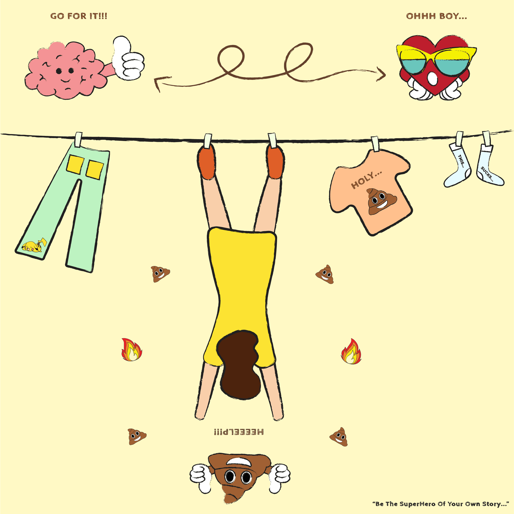
That being a Cancer Survivor changed my approach toward health - I started doing more research on gut health and why the gut is called a "second brain"
That I want to use art to educate people
That this experience of working on this project in the 12 weeks total, along with 5 other projects parallel, could be described as "one long feed-forward session"
That I couldn't envision it developing into this powerful, colorful gutsy story
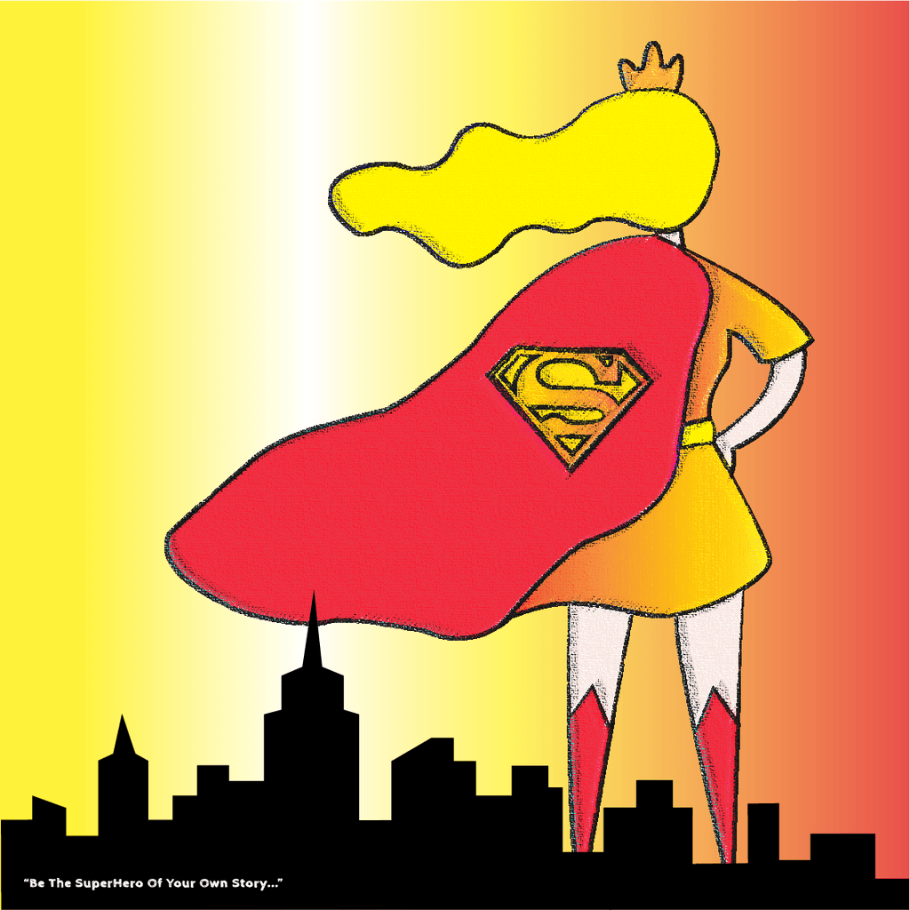
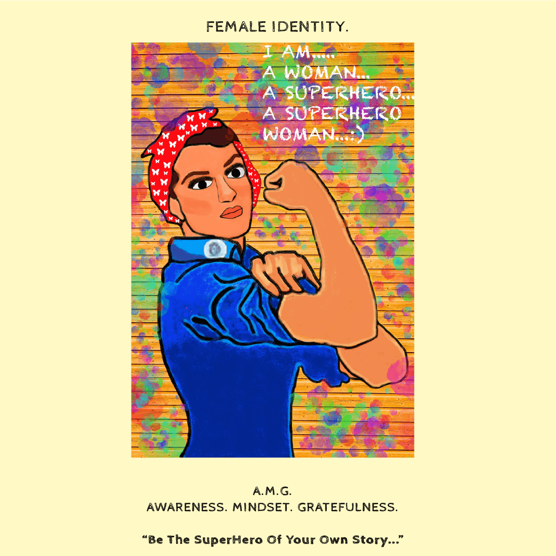
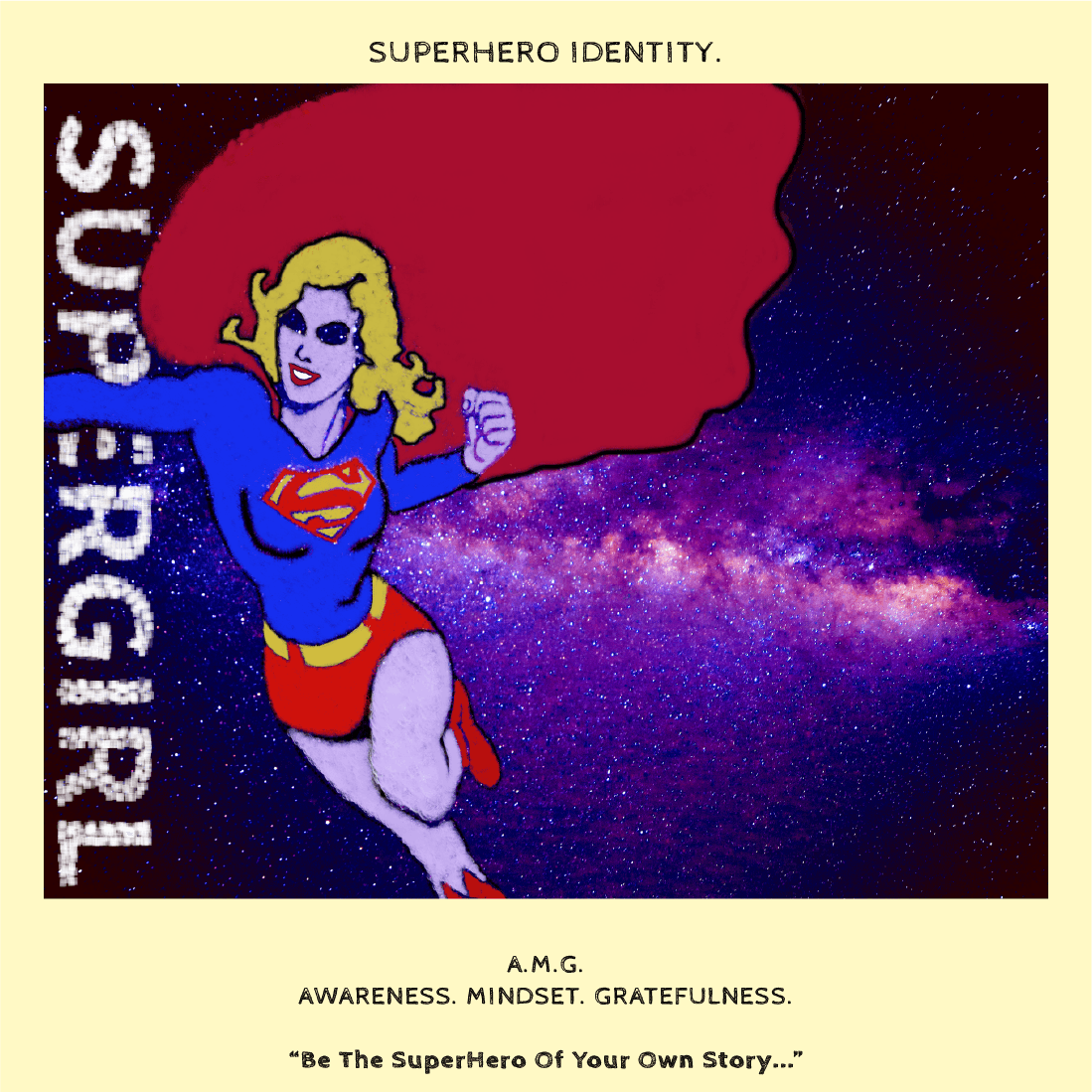
That everyone can become the SuperHero of their own story, and Wind Hill products are just one step towards it :)
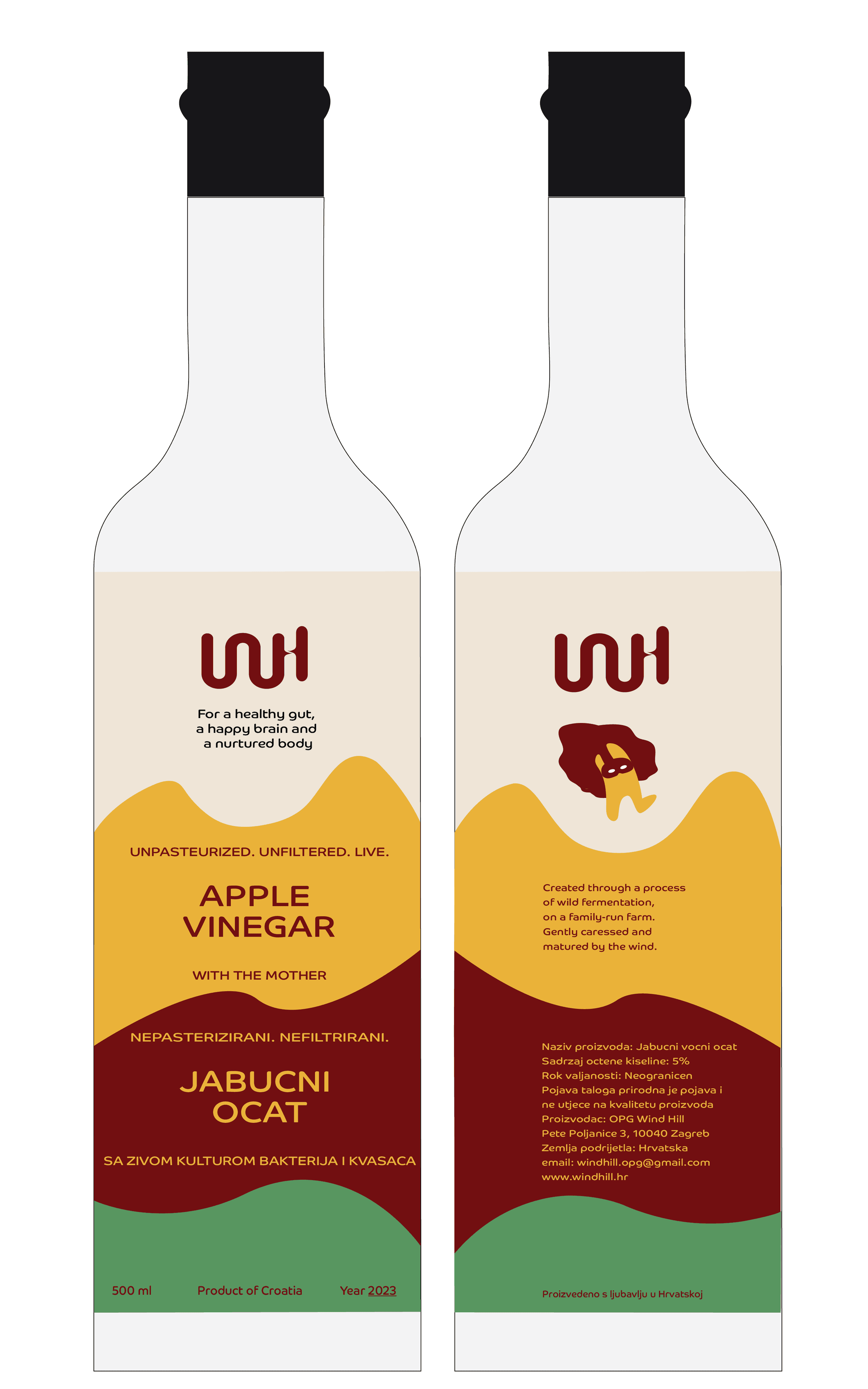
LABEL DESIGN
LOGO - placed at the top, alongside the UVP, with Gutsy featured on the back
COLORS - three primary brand colors, arranged vertically and shaped to resemble the hills of Croatia
FONT - showcased in the brand’s main colors
TEXT - bilingual, available in both English and Croatian
BROCHURE DESIGN
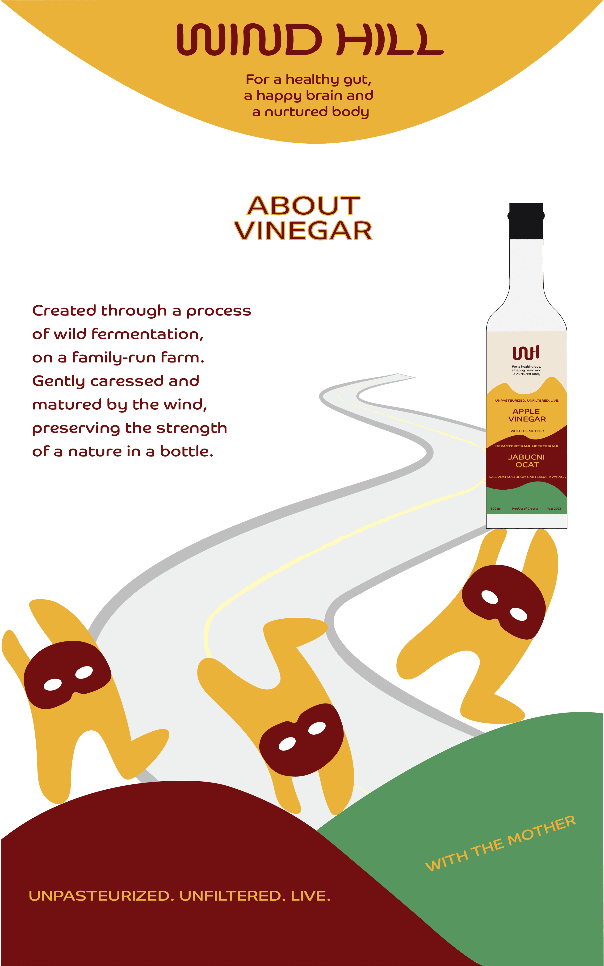
Designing a brochure with essential information about the brand, products, and pricing
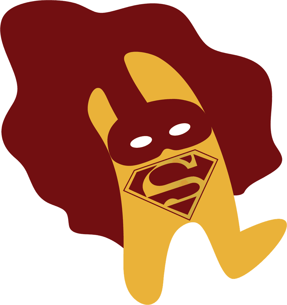
MASCOT DESIGN - GUTSY
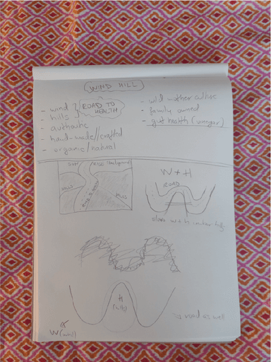
While sketching one of the many logo designs, I drew a superhero mask on the letter "H." And just like that - "H" became a Hero, a Gut Hero - giving birth to the mascot "Gutsy"
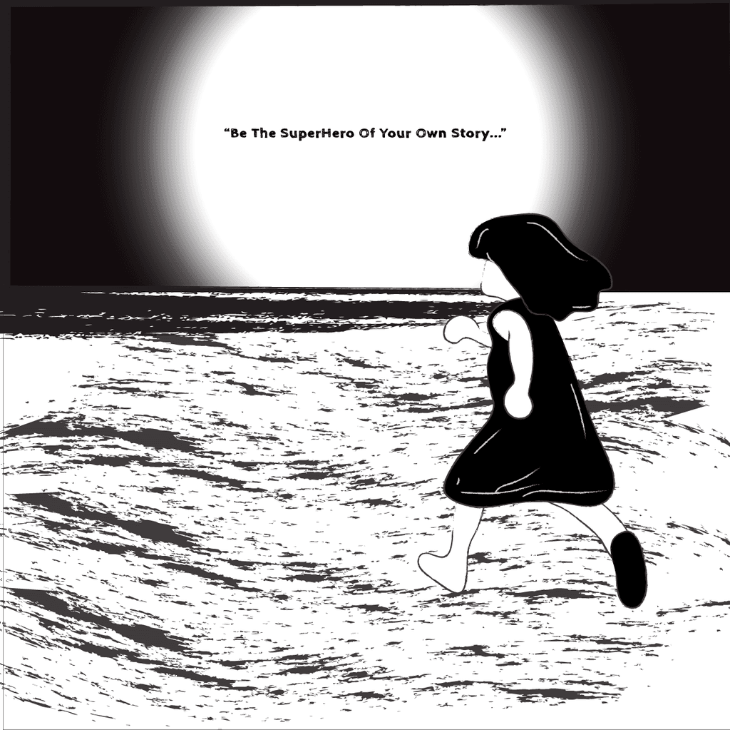
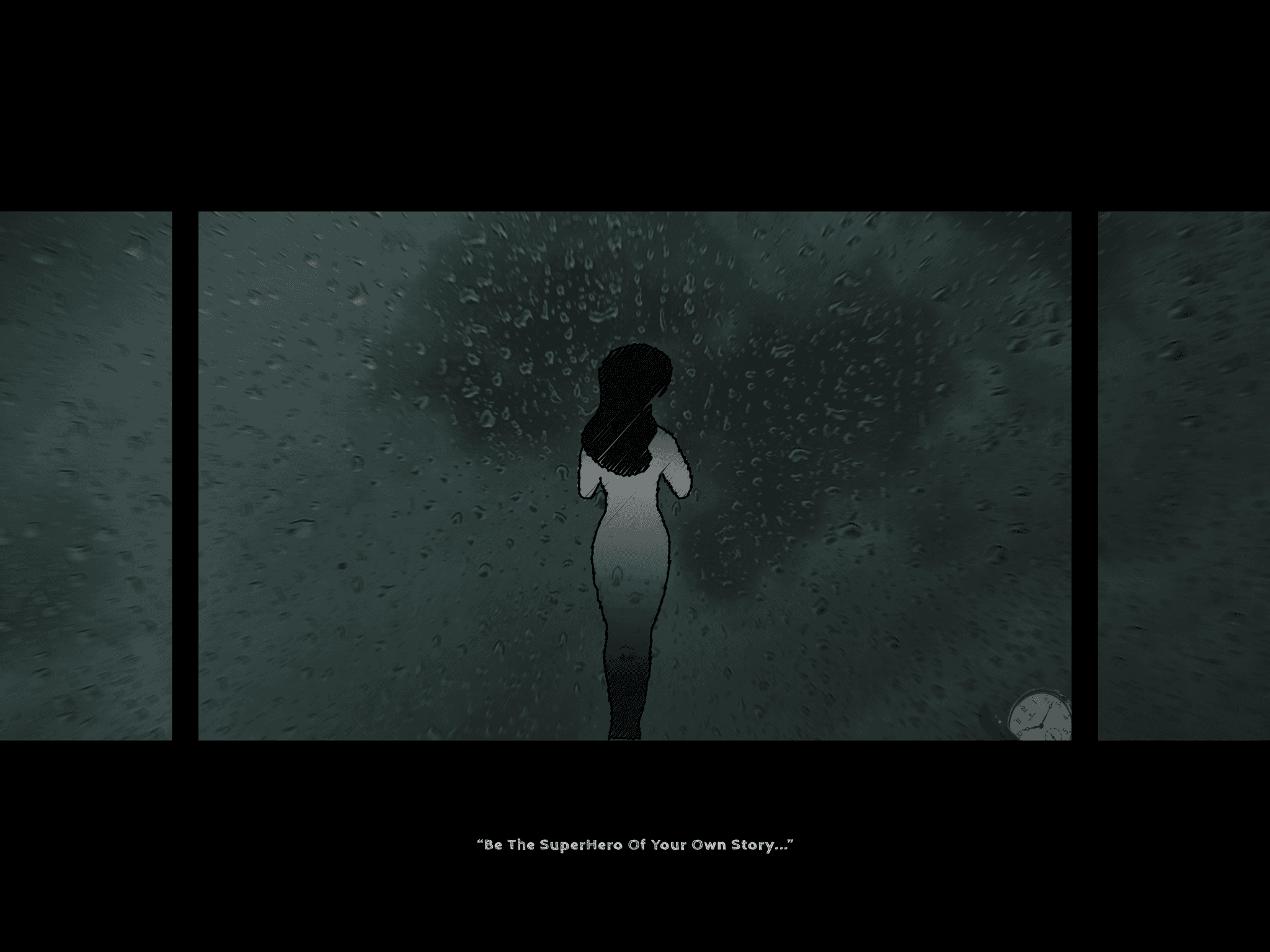
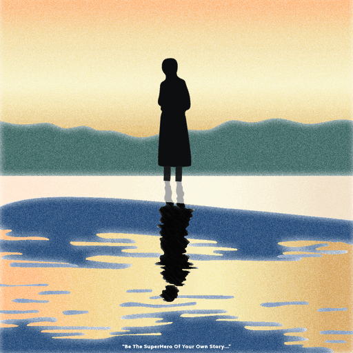
Gutsy became the voice of Wind Hill, a communication tool symbolizing intuition, intelligence, and courage. He also served as an inspiration for the Storyboard
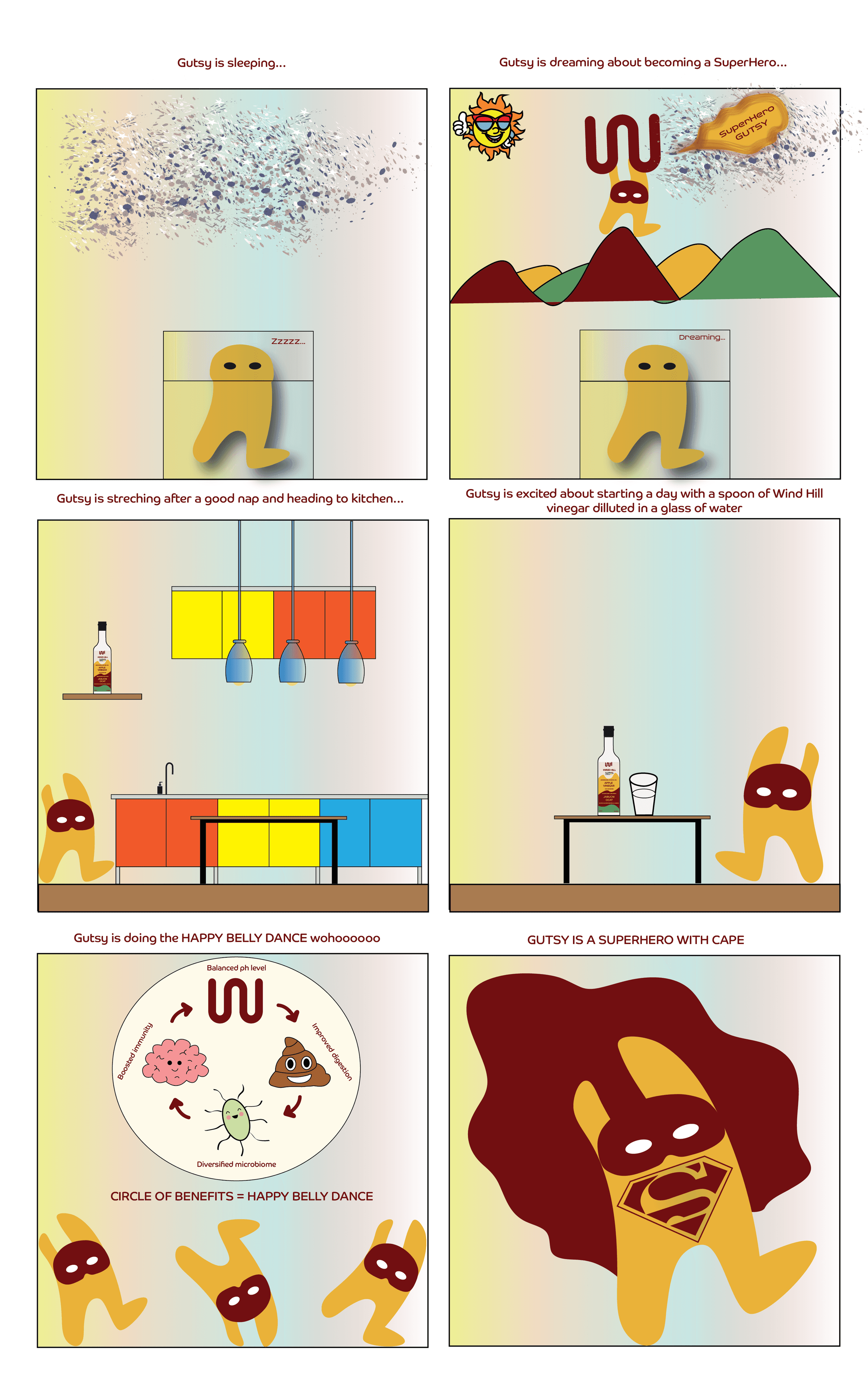
STORYBOARD
GOAL - creating a story about becoming the Superhero of your gut health
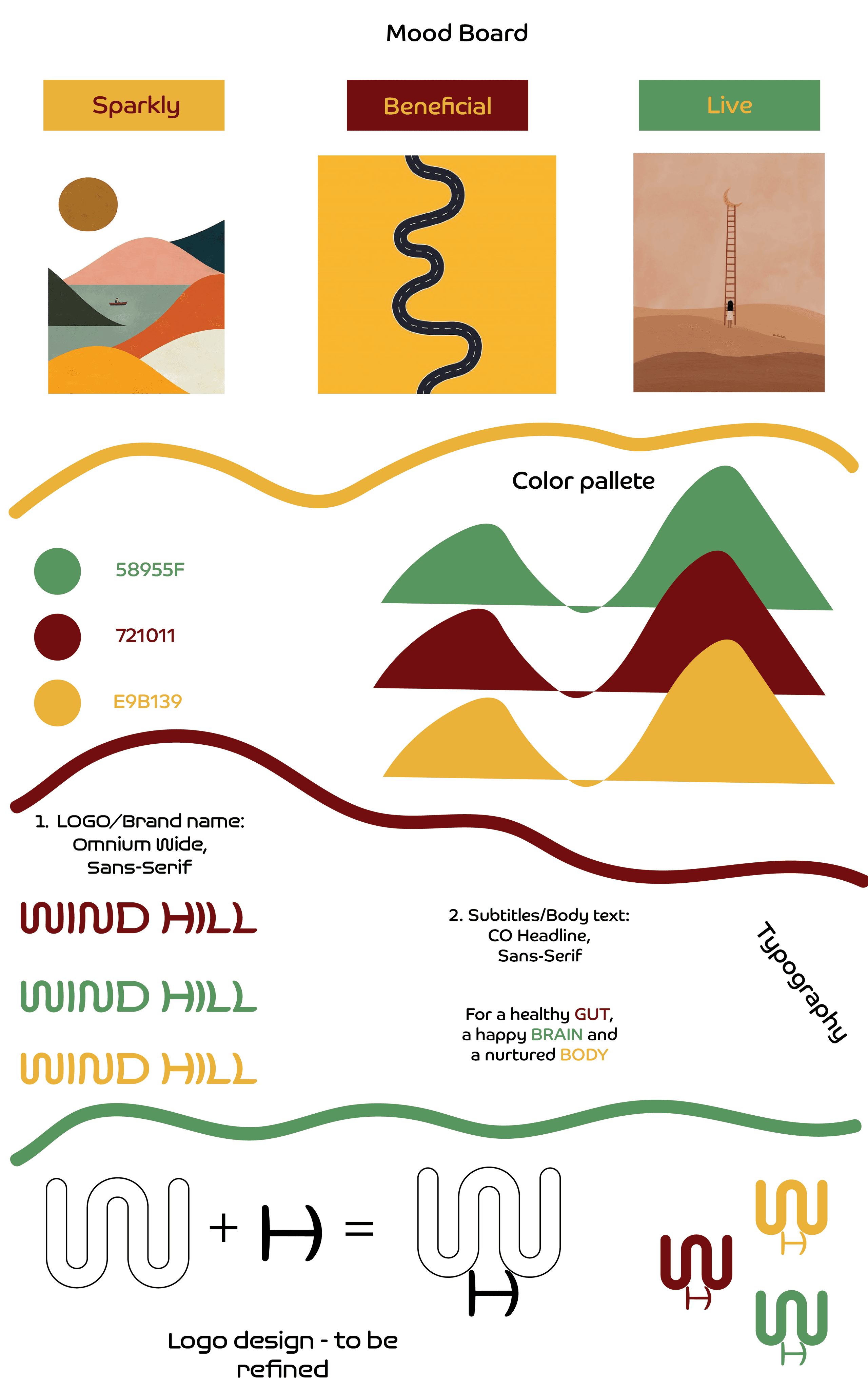
COLOR PALETTE - three colors
CHERRY RED - the color of healthy blood and various fruit cultivars for vinegar (apples, cherries, jostaberries, rosehip)
GREEN - reflects the lush, beautiful hills of Croatia, as well as fig cultivars & fields
YELLOW - inspired by the golden hues of Croatia’s hills, along with pear and medlar cultivars
TYPOGRAPHY - two fonts
OMNIUM WIDE (Sans-Serif) - for the brand name Wind Hill; windy and curved
CO HEADLINE (Sans-Serif) - for subtitles/heading/body text
BRAND DETAILS
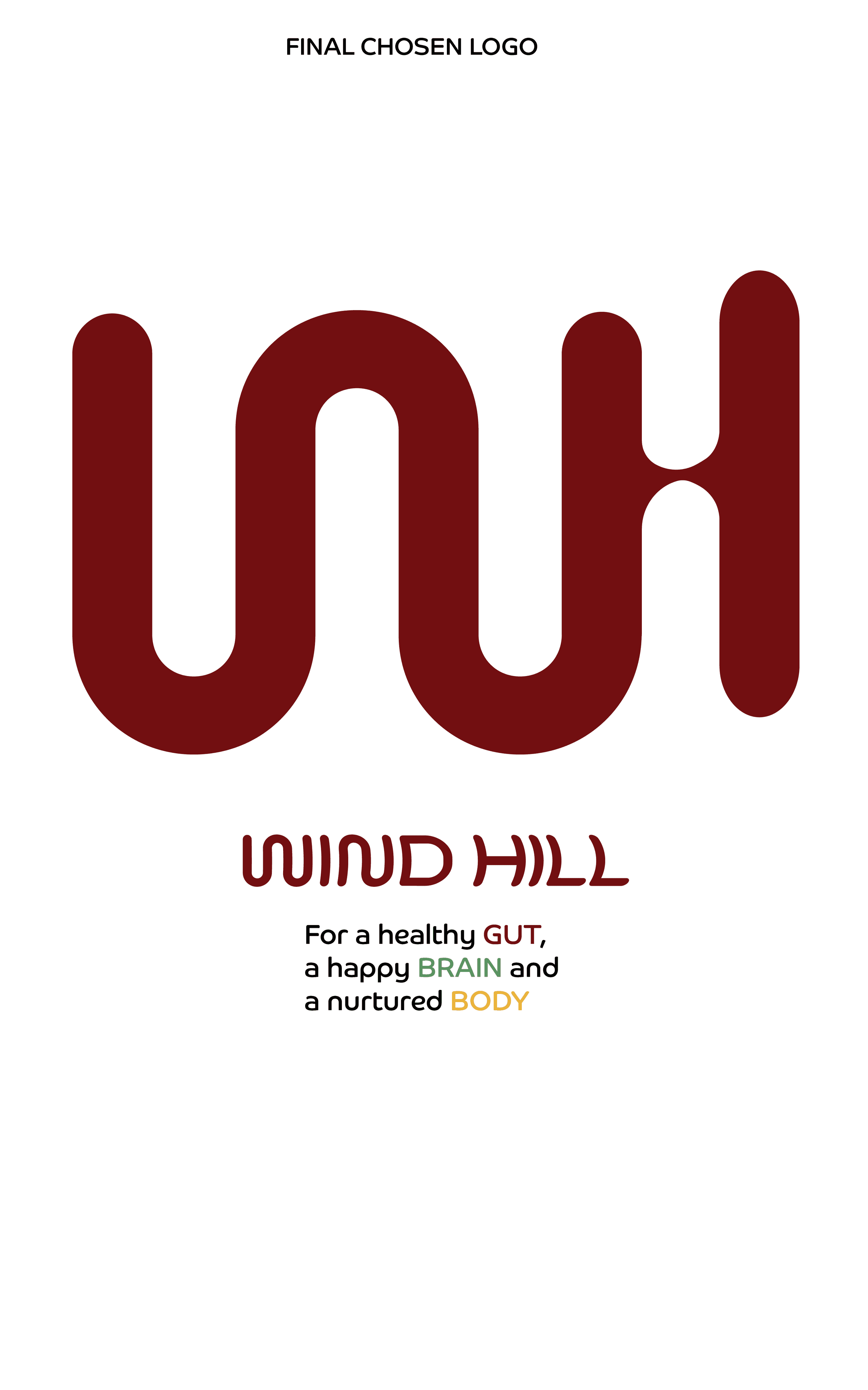
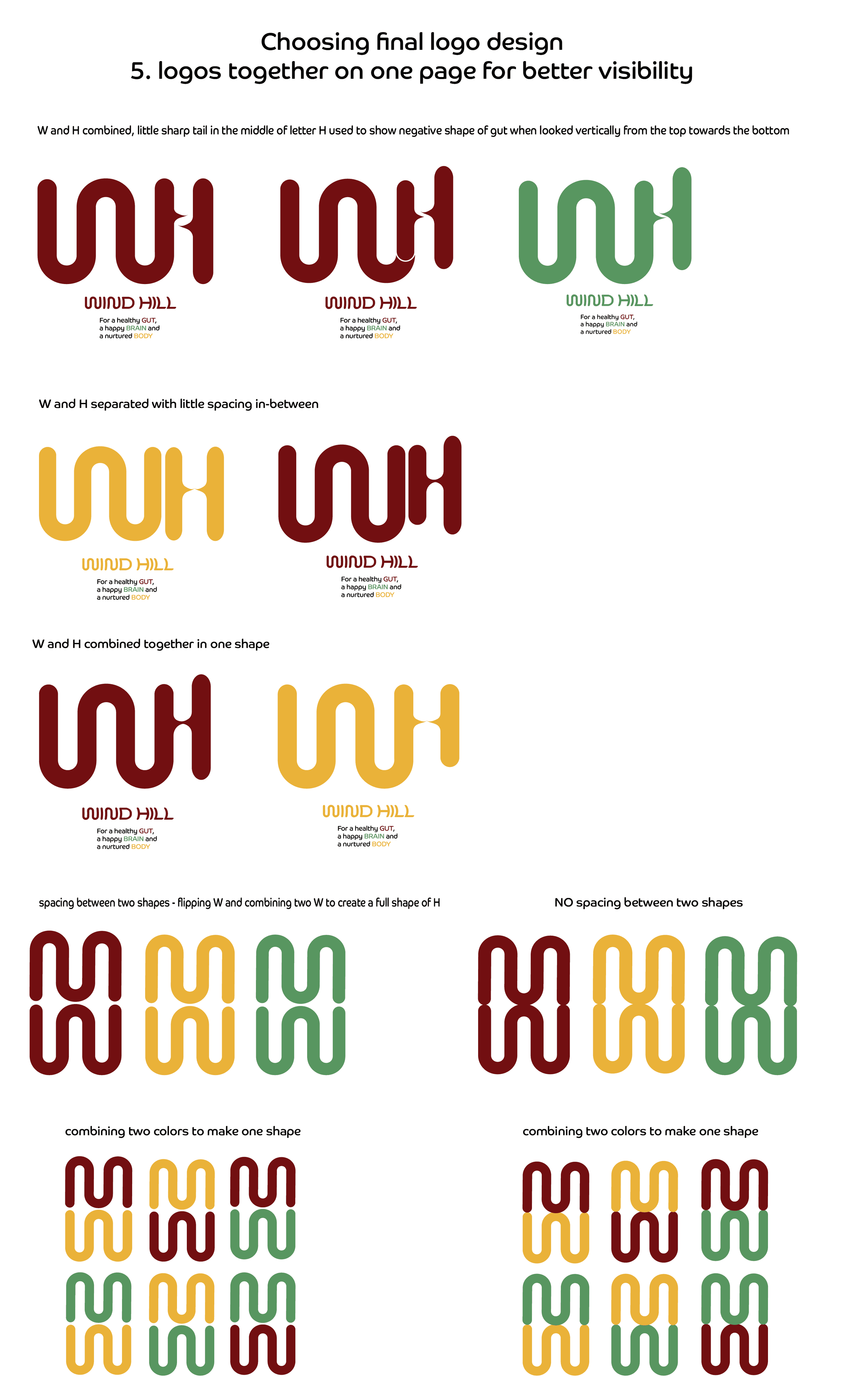
LOGO DESIGN - combining letters “W” and "H" into one shape
"W" for "WIND" - shaped like the gut, presents the curvy road to a healthy gut
"H" for "HILLS" - presents ladders to climb to get to the gut road; the little sharp tail in the middle of the letter "H" shows the negative shape of the gut
SCOPE & DELIVERABLES
This project was designed in the Graphic Design Studio course, in 12 weeks
I designed 8 deliverables:
Logo / Color palette / Typography / Label design / Mascot design / Storyboard / Brochure design / Website design
PROBLEM STATEMENT & GOALS
Delivering a message of gut health vitality to a young audience (ages 20-40)
Educating about the health benefits of WH vinegars with wild mother culture, compared to mainstream pasteurized vinegars with additives
WIND HILL IS SPARKLY, BENEFICIAL & LIVE


THE BRAND WIND HILL
Wind Hill is the name for home-grown and hand-made craft vinegar products
The vinegars are unfiltered, unpasteurized, and live, with the wild mother culture
Created through a process of slow, wild fermentation, on a family-run farm in Croatia
The result of consummation is a healthy gut, a happy brain and a nurtured body
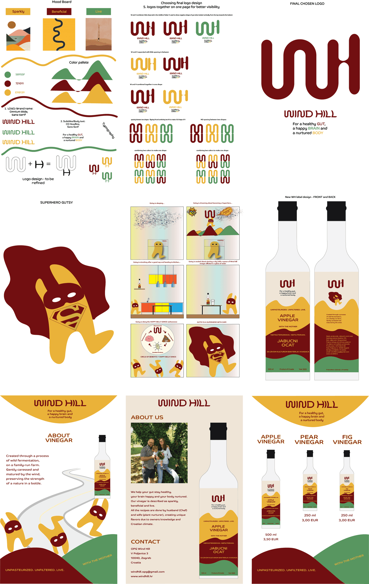
5) BRAND IDENTITY DEVELOPMENT
Logo design
Brochure design
Storyboard
For a healthy gut,
a happy brain, and
a nurtured body
ANA


Smiley
Smiley
STRATEGIC GRAPHIC DESIGNER SPECIALIZED IN PACKAGE DESIGN/ STORYTELLER / BOOK ILLUSTRATOR
The Illustrator of happiness!


Mobile Design
UX
UI
Human-centered design


FOLLOW ME ON MY
DESIGN JOURNEY
FUN FACTS


HARD SKILLS


SOFT SKILLS


EXPERIENCE


EDUCATION


-> Strategic Graphic Designer specialized in Package Design
-> Storyteller
-> Book Illustrator


ABOUT
ABOUT
A BOX FULL OF FRESHNESS & YUMMINESS
ILLUSTRATIONS IN THE BOX
The idea was to present a heartwarming & joyful story about homemade cookies who gather families together
In the Balkan cookies ("Kukis” in Serbian) are associated with childhood memories & aromas that filled grandma's houses
The family consists of mom, dad, 3 kids, grandpa, grandma, a dog & a cat - all gathered around the school where Kukis are baked
Passed down through generations, these traditional recipes have become a symbol of family gatherings


VISUAL STORYTELLING THROUGH ILLUSTRATIONS
A WARM STORY ABOUT FAMILY WHO MAKES HOMEMADE COOKIES
THE BRAND EXCLLLUSIVE
The name "Exclllusive" holds a special significance, with the three letters "L" representing the first initials of the family's kids - Lana, Luka & Lara
That's why "L's" are stacked on top of each other, and crafted into a cookie-shaped logo, becoming the heart of the brand identity
The brand's tone is oriented toward family, coziness, sharing, warmth & joy


1) COOKIES PACKAGE DESIGN
New Brand Identity
Visual Storytelling
Character Illustrations
HOMEMADE
LAVENDER SYRUP
HOMEMADE
ELDERBERRY SYRUP
HOMEMADE
LEMON SYRUP
DIGITAL ILLUSTRATIONS USED ON PACKAGES


2) SYRUPS PACKAGE DESIGN
Premium package design
Storytelling
Digital Illustrations


Mood board as an inspiration


MON - going to school to study


TUE - enjoying the #littlethings in my favorite park


WED - prioritizing self-care,
online Therapy sessions


THU - hanging with friends before going to school & work
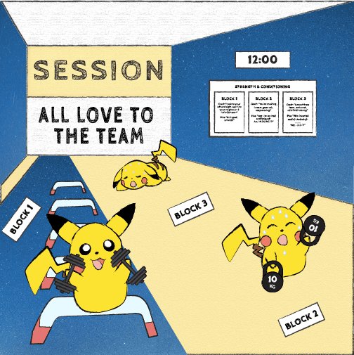

FRI - training in the gym with the most supportive community
OVERVIEW
This autobiographical Children's Art Book captures my daily life in NYC through playfully illustrated storytelling
PIKACHU —> the narrative storyteller and protagonist, brings a unique perspective to my daily life routines. Pikachu is illustrated in many different roles - as a full-time student, an athlete who loves to train, an individual who's devoted to prioritizing "me-time" & mental health
My goal was to combine autobiography, storytelling & visual design, creating a unique blend of narrative & creativity


3) CHILDREN'S ART BOOK
Autobiography
Narrative Storytelling
Digital Illustrations
LOGO DESIGN
MAGAZINE, CALENDAR & NEWSLETTER DESIGN
4) VISUAL STORYTELLING THROUGH ILLUSTRATIONS
WHAT I'VE LEARNED
That I love supporting my friends in their entrepreneurship journey
That being a Cancer Survivor changed my approach toward health - I started doing more research on gut health and why the gut is called a "second brain"
That I want to use art to educate
That this experience of working on this project in the 12 weeks total, along with 5 other projects parallel, could be described as "one long feed-forward session"
That I couldn't envision it developing into this powerful, colorful gutsy story
That everyone can become the SuperHero of their own story, and Wind Hill products are just one step towards it :)
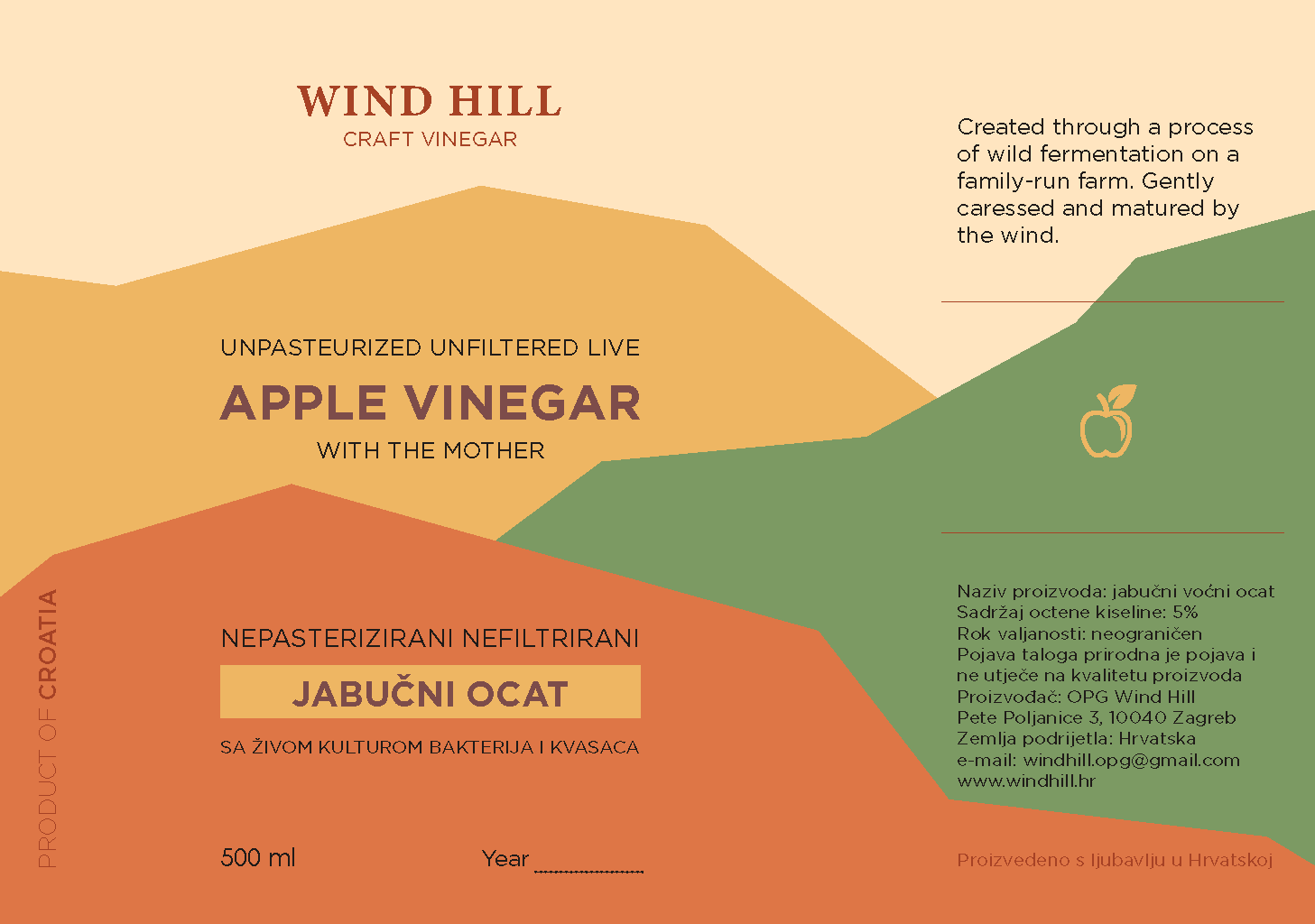
LABEL DESIGN
LOGO - placed at the top, alongside the UVP, with Gutsy featured on the back
COLORS - three primary brand colors, arranged vertically and shaped to resemble the hills of Croatia
FONT - showcased in the brand’s main colors
TEXT - bilingual, available in both English and Croatian
BROCHURE DESIGN
Designing a brochure with essential information about the brand, products, and pricing
MASCOT DESIGN - GUTSY
While sketching one of the many logo designs, I drew a superhero mask on the letter "H." And just like that - "H" became a Hero, a Gut Hero - giving birth to the mascot "Gutsy"
Gutsy became the voice of Wind Hill, a communication tool symbolizing intuition, intelligence, and courage. He also served as an inspiration for the Storyboard
STORYBOARD
Goal - creating a story about becoming the Superhero of your gut health
COLOR PALETTE - three colors
CHERRY RED - the color of healthy blood and various fruit cultivars for vinegar (apples, cherries, jostaberries, rosehip)
GREEN - reflects the lush, beautiful hills of Croatia, as well as fig cultivars & fields
YELLOW - inspired by the golden hues of Croatia’s hills, along with pear and medlar cultivars
TYPOGRAPHY - two fonts
OMNIUM WIDE (Sans-Serif) - for the brand name Wind Hill; windy and curved
CO HEADLINE (Sans-Serif) - for subtitles/heading/body text
BRAND DETAILS
Logo design - combining letters “W” and "H" into one shape
"W" for "Wind" - shaped like the gut, presents the curvy road to a healthy gut
"H" for "Hills" - presents ladders to climb to get to the gut road; the little sharp tail in the middle of the letter "H" shows the negative shape of the gut
SCOPE & DELIVERABLES
This project was designed in the Graphic Design Studio course, in 12 weeks
I designed 8 deliverables:
Logo / Color palette / Typography / Label design / Mascot design / Storyboard / Brochure design / Website design
PROBLEM STATEMENT & GOALS
Delivering a message of gut health vitality to a young audience (ages 20-40)
Educating about the health benefits of WH vinegars with wild mother culture, compared to mainstream pasteurized vinegars with additives
WIND HILL IS SPARKLY, BENEFICIAL & LIVE


THE BRAND WIND HILL
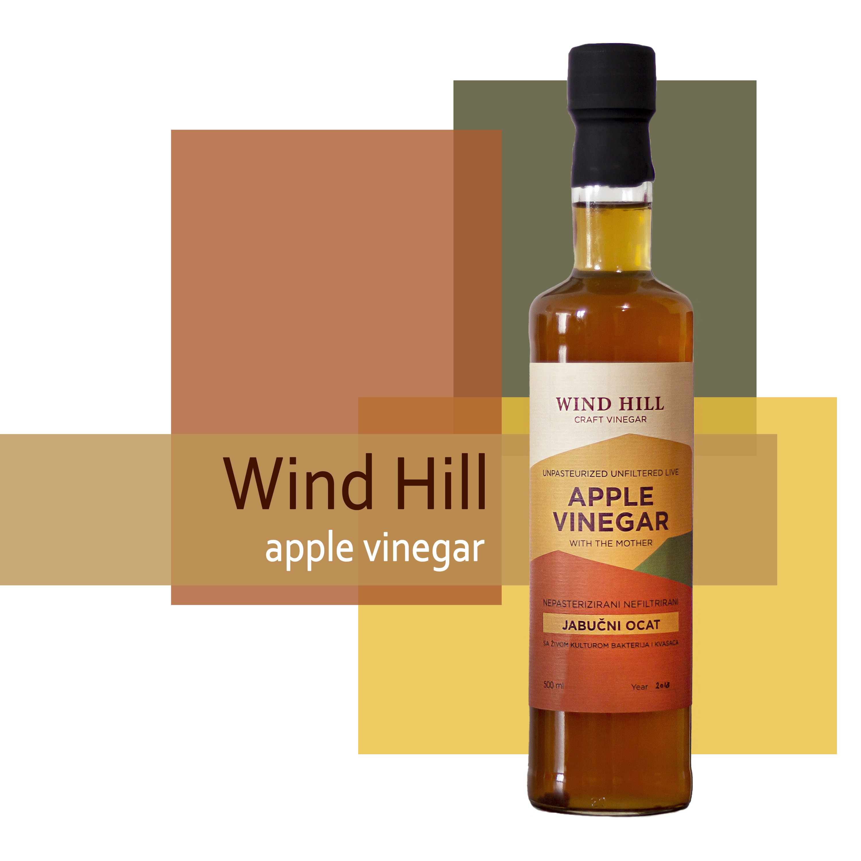
Wind Hill is the name for home-grown and hand-made craft vinegar products
The vinegars are unfiltered, unpasteurized, and live, with the wild mother culture
Created through a process of slow, wild fermentation, on a family-run farm in Croatia
The result of consummation is a healthy gut, a happy brain and a nurtured body
For a healthy gut,
a happy brain, and
a nurtured body
5) BRAND IDENTITY DEVELOPMENT
Logo design
Brochure design
Storyboard

